Amongst the endless grid copying, papier mâché body parts and the big hitters, the one unifying thing that people seemed to do in art at school was a pencil drawing of a shoe. I recall two or three being brilliantly exact, photo-realist masterpieces, some half-decent to middling efforts, a few were more joyously cartoonish whilst others merely resembled dead slugs or something else that was clearly not a shoe. We put them all up on the wall and had a good laugh at the really bad ones, whilst the teacher stood back, desperately scanning for any glimmers of talent. I guess that the exercise was to try and represent something that you knew inside out on a crappy sheet of A4 - a non-art object as a symbol of your way of thinking.
Read MoreEssays / Exhibition news / Publications
Bums on seats dear boy! (art in the age of analytics) Part III
From an artist’s point of view, your virtual presence is now dictating how others perceive your work more than ever. No decent website, no decent artist.
Onto the work I have been developing over the last fortnight…
Read MoreBums on seats dear boy! (Art in the Age of Analytics) Part Two
Look at me! Look at me! I’m writing about attention. I’m trying to be clever and ironic. Right? If you’ve decided to read on for Part Two then it must be working. So here is the explanation of the said idea.
Read MoreStraight from the horse's ass (part 2)
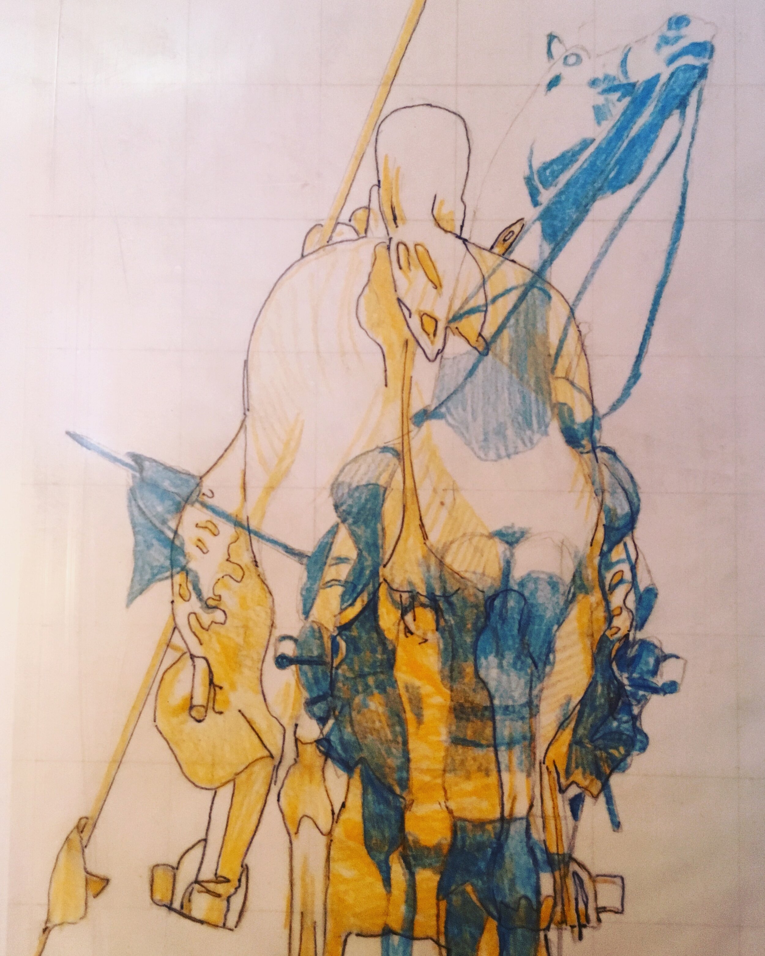

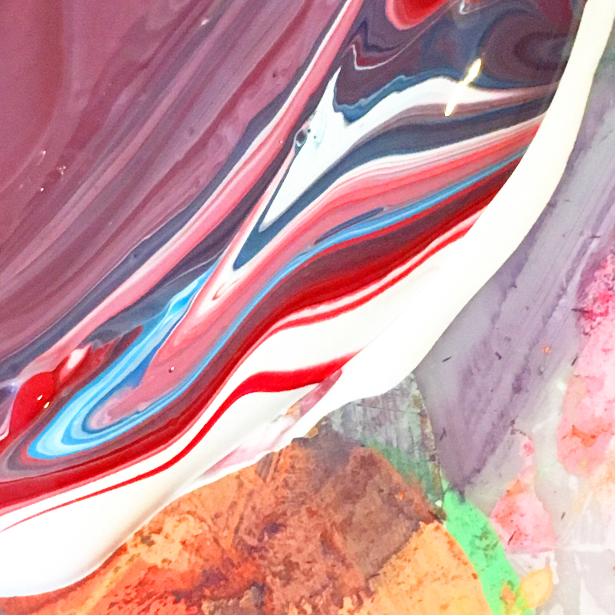
The concept took prescedence last week in part one, so I thought part two should contain some more technical details on the work but include some more insight as to how it is being made and why. The photos in the gallery (click to enlarge) are of the first piece in a series of five. They show the progression from the initial photograph to colour study and then full scale.
Speaking of scale, I found it essential to get as close as possible to a 1:1 (from the view at street level at least) to convey the uniformity that the chosen subjects have in the real world. Seeing as the concept is based on power, I found the decision to replicate and repeat entirely fitting.
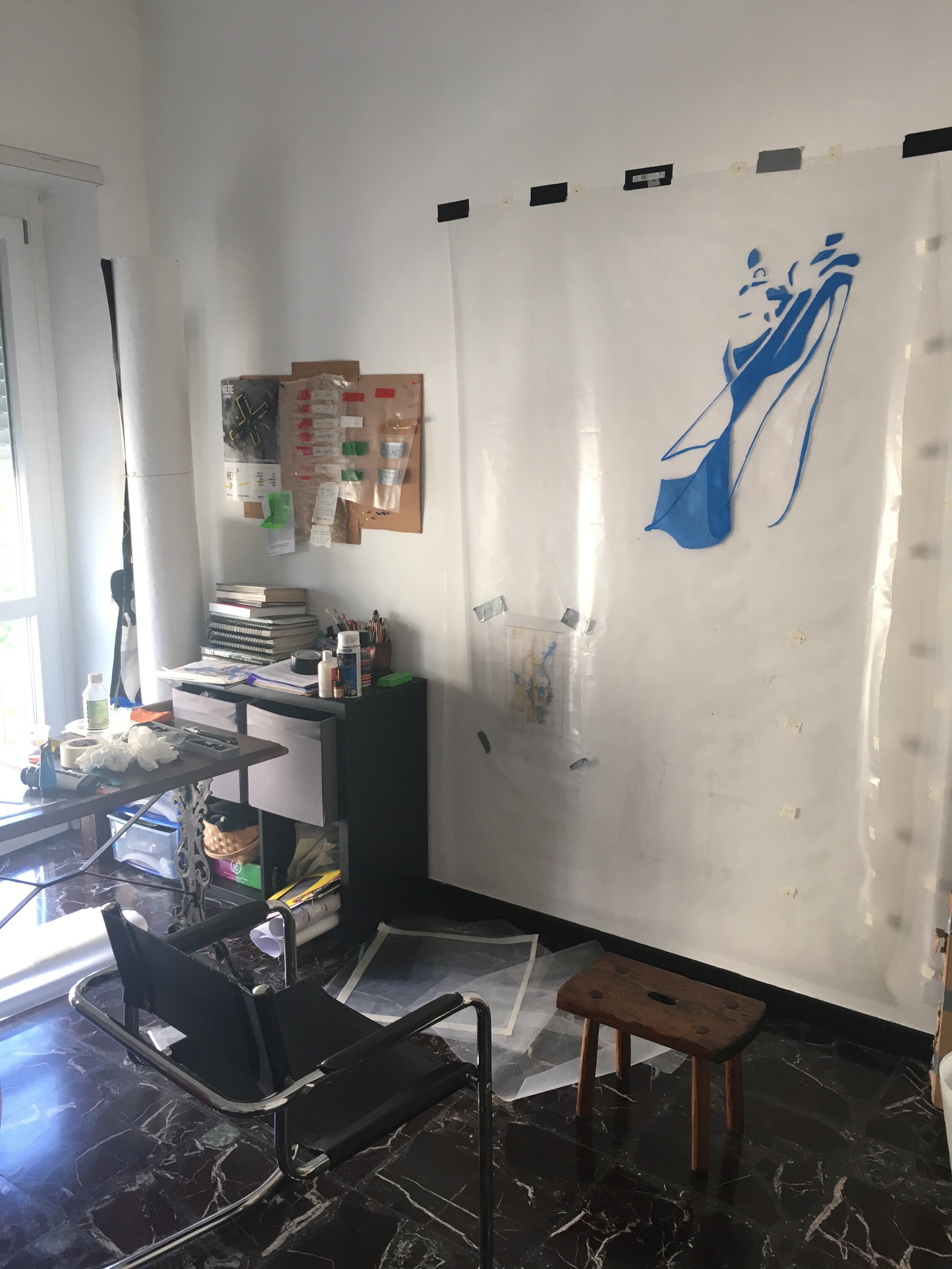
The material is polythene, each of the five sheets measuring 2100x1500 mm. As painting on plastic is damn near impossible I had to experiment and produced a formula which I cannot disclose for obvious reasons.
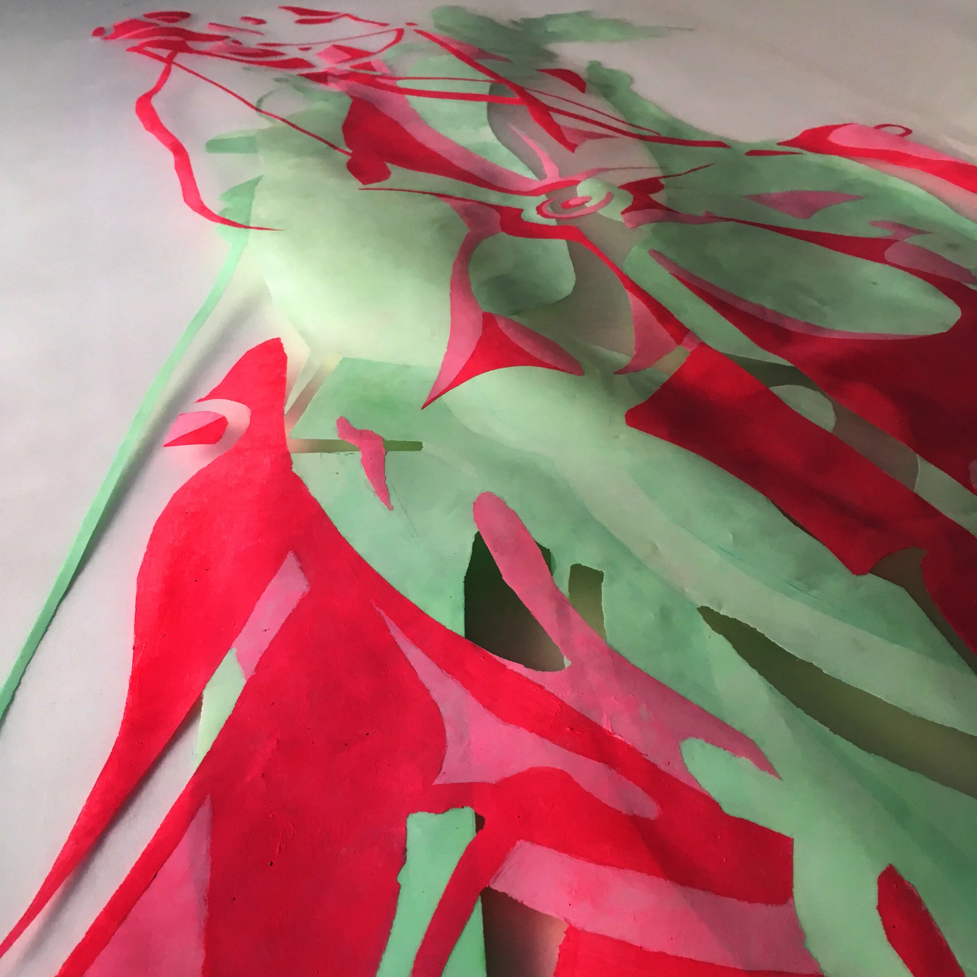
When it came to the colour scheme (as you can also see in part one) the work relies heavily on the complimentary scale to represent duality. Contrasting colours such as blue and yellow speak of a number of different things, high on the list being political parties, moods or even personal preferences. However, the very nature of a clash, presented on two sides of the same object emphasises what people in power are inevitably conflicted by; that human nature often derails a principle.
The composition of each piece (as aforementioned) is based around the front and back of each monument. Due to the subsequent narrowness, each side makes an abstraction of the other (see part one for a better example) and the combinations sometimes give no real clarity on what you’re actually looking at. The blank areas on one side render the base layer of the other entirely visible and create an interesting dilemma on where to shift your vision.
In light of recent events in the UK; once the last part of this work is underway, the further political context of the work will be explored next week.
Straight from the horse's ass (Part 1)


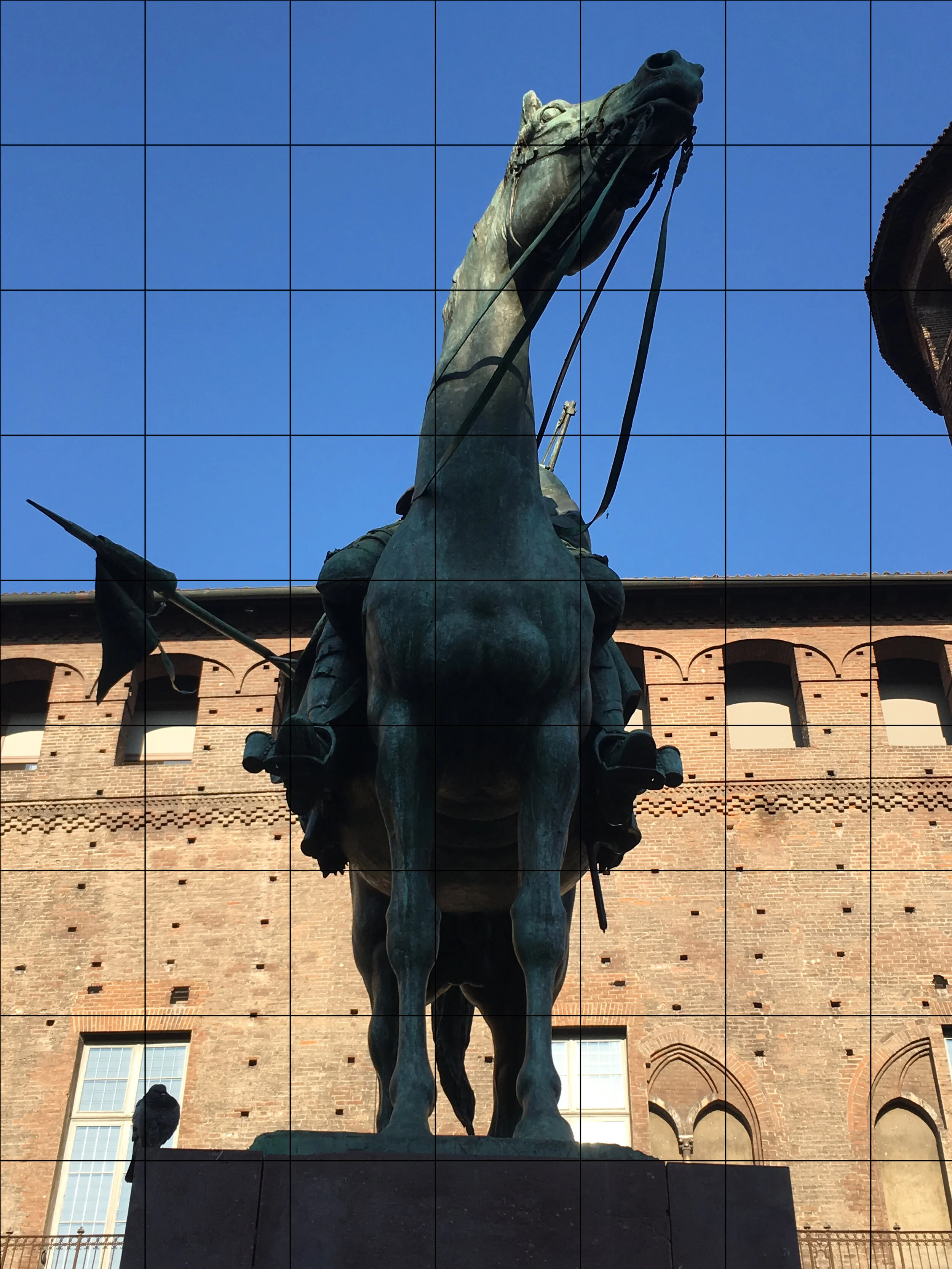
The history of the horse and its consequent relationship to us has culminated in a complex symbol that has allowed us to produce a plethora of artistic interpretations. Horses make us think of strength, richness and perfection. Pictorially, they hold a place in art history as powerful representations of status. Even in common phrases and jargon: ‘the width of a horse’s ass’, ‘wins by a nose’ or indeed, ‘straight from the horse’s mouth’.
Along with ‘get off your high horse’ and ‘hold your horses’, they form the crux of what this piece is about. Relatively speaking, the preconceived ideas that we have about power have been interesting to investigate and transform into something visually.
Torino has had a particular role to play in the formation of what we now know as the Italian state: French occupation, the Savoia dynasty and the Risorgimento, things which are clearly in evidence by what we see in the streets and piazzas. The monuments therefore are vital for this idea of power and what it means to our urban environment.
When they were designed the idea was to immortalise people as national heroes using idealism, romance and the horse’s symbolic potency. However, such beautiful forms got me thinking about how they reflect on our current society? We still have leaders and important people but they are (and will be) presented completely differently. Politicians are eager to be seen as approachable, honest and thoughtful but we ironically know more about them and their flaws these days than say, Testa de Ferro or Ferdinand D’Savoia - but they are still public figures none the less and still have the same ambition and ruthlessness as those cast in bronze. The question is how much do current leaders wish to be seen or are seen as such?
The conception of the work and the representation of the two-faced nature of elitism and modern politics both came from this.
It struck me as interesting that (considering the perfect forms in front of me) that there are two different viewpoints from which any ‘immortal on horseback’ cannot not be seen and identified; from up the horse’s nose and from up its ass. The careful consideration of the sculptor and his workshop to convey the hero is lost with each example. Funnily enough all you are confronted with is either a strain of neck muscles or a pair of giant testicles.
I found this to be ideal territory for the new work, representative of the high society figure as a joke who can never fully achieve power because our society has become disinterested and hypercritical.
More to come in the next post on December 13