Essays / Exhibition news / Publications

IPA (6.5% concept art)

A day job is one of those stubbornly real aspects that, as an artist, you try to suppress (or at least try not to mention) as much as possible. Such a dirty word spoils the romantic image of an artist existing for their own work and very little else. It does however, remain an image that is pushed on us as students; that having the freedom, time and space to do whatever you want equals success amongst your peers. If you still indeed have a day job, then you are tainted and linger in the realm of failure - simply due to its very existence. It’s certainly the case that you just don’t hear about most of the crap jobs that most noted artists have done because most biographers conveniently forget to include them; perhaps the justification being that such ‘a means to an end’ is irrelevant and purely circumstantial.

Yet this short essay aims to explain that without the day job then “The Dilemma” would probably never have been made. “The Dilemma” is a recent, conceptual work that addresses language, or more specifically, the language of art. It consists of a short statement printed onto a transparent PVC sheet and is hung by two bulldog clips.

Over the last few months, I have been negotiating the ‘sound’ of spoken English with some of my students. At certain points I have found myself broaching the subject of phonetics to illustrate what I mean, the most obvious example being the schwa - a term that is relatively unknown to non- native speakers (or native ones for that matter). In the beginning it was a bit lost on them as to why most British people say “cuppa tea” instead of “cup of tea” but once I had explained that it’s mainly down to laziness (like most languages) they gradually understood it. In the International Phonetic Alphabet the schwa is represented by an upside down ‘e’ and after having drawn it dozens of times on a blackboard, I noticed that this type of text creates a slight conundrum:

If the IPA is supposed to help people with clarifying a language, then why does most of it look like complete nonsense?

There is a case to be made that this alphabet, by its very nature, doesn’t place any real significance in the words but I would argue that normal words can be just as empty. My point here being that the language of art (or what has become ‘International Art English’) is now so up itself that art essays, press releases and catalogues have been littered with portentous, loaded words for some time - the nouns being particularly culpable. I can’t say that I’m blameless in this matter; there have been times when I’ve written ‘entropic spaces’ and ‘non-states’ etc because it seems like you’re not taken seriously if you don’t use IAE. Art is a foggy subject already but it’s still quite fashionable to mystify it even further by using such terms. Just pick out any exhibition leaflet and I guarantee that you will find at least a dozen.

“The Dilemma” is a representation of how language is generally used in the art world and an example of how concept art is one of the more contentious, yet ultimately fascinating, forms of art. So I thought that it would be interesting to display a conceptual idea in IPA – a comment on ‘understandability’ if you will. Here follows a version of the printed text and a recorded translation in English:

ɪn ˈɔːdə tə meɪk ðə saʊndz əv wɜːdz mɔː ˈtænʤəbl, sʌm ˈpiːpl juːz ðɪs ˈmɛθəd. ɪt ˈʤɛnərəli sɜːvz əz ə gaɪd tə prəˌnʌnsɪˈeɪʃən bət ˈlɑːʤli əˈmɪts ðə ˈmiːnɪŋ əv ðə wɜːdz ðəmˈsɛlvz.


djuː tə ðə fækt
ðət ðɪs həz biːn ˈrɪtn aʊt əz sʌʧ kri(ː)ˈeɪts ðə ˈfɒləʊɪŋ dɪˈlɛmə:


həz ðɪs kənˈsɛptjʊəl ˈɑːtˌwɜːk biːn ˈrɛndəd ˈiːzɪə tʊ ˌʌndəˈstænd bɪˈkəz ɪt hæz, ɪn ə ˈsɜːtn weɪ, biːn spɛlt aʊt fə juː, ɔː həz ði aɪˈdɪə ˈmɪəli ˈdɪsɪpeɪtɪd ˈɪntə ə ˈsɪəriːz əv ˈlɛtəz ənd ˈsɪmbəlz ðæt, ət fɜːst glɑːns, meɪks ˈvɛri ˈlɪtl sɛns

Once I had changed this into IPA then the idea really did come alive. All the symbols that I recognised from teaching started to appear but because I had never really gone beyond one or two words in isolation before, the text just became an aesthetically pleasing mess.

So therein lies the joke. Artists and collectors use IAE on a daily basis but is really is style over substance, with the writer being the beneficiary of their own words. The back up joke lies with the fact that the statement is printed onto a transparent sheet, so are you rendering yourself invisible by using IAE or revealing yourself to be a fraud...? Maybe both.

If you’d like to find out more about IAE, then here’s a link to an excellent piece, written by A.Rule and D.Levine - produced by Triple Canopy.

 https://www.canopycanopycanopy.com/contents/international_art_english

“The Dilemma” follows another text based piece, the first being “A Coincidentalist Work”, made in tribute to John Baldessari, who remains a huge influence up to this very moment of typing. He was also a teacher (the biographers mention this one quite famously) and in many ways the professorial attitudes of being direct, personable and  ‘performative’ come through well in his text pieces- like the glaring immediacy of a teacher’s hand written note on a homework assignment.

Once I had thought of these ideas for my own work (either through a day job or not) I enjoyed wrestling with how funny they ought to be and furthermore, if conceptual statements like this offer little to the viewer apart from the artist’s own banal sense of self-awareness. I’m intrigued by the way that people sometimes roll their eyes at pieces like this; it signifies a level of understanding that it’s all too easy and breaks the stigma that is often attached to ‘unfathomable’ conceptual art. Sometimes making a point of stating the obvious isn’t such a bad thing.

Bums on seats dear boy! (Art in the Age of Analytics)

bums on seats banner.JPG

There’s an old saying in the English theatre business, “Bums on seats, dear boy, bums on seats”.

I heard it many times during my brief tenure as a spotlight operator some years ago, either in the auditorium itself, in the green room or after the show and I used to cringe every time someone uttered it. In any case it humoured me that this stereotype really did exist and that how such a comment on attendance rendered the quality of the actual show largely irrelevant. All that matters is how many people saw it.

The story, characterisation, music, lighting, script, backdrop etc- all crunched into a series of figures that can be looked back on as evidence of a hit once the run is over.

I am of course referring to if a show is in any way more popular than expected. If there are lots of people to see it each time, then in most people’s eyes, it’s considered a success; even if the production is awful and strewn with errors, “you can’t argue with the box office”. The added hype that circles around popularity has always been impossible to stop before it naturally ends up like a used ticket stub in a wet gutter somewhere.

I only mention this back story as a type of introductory allegory for what could be discerned these days as a by-product of the ‘attention culture’ and to broach the subject of this post.    

What is ‘attention culture’ and how did we get here? From my own perspective, artists have to compete with each other, let alone the general public and its difficult to say how long your ‘moment’ can last for; add to the story, add to the story, make it more goofy and irreverent so that everyone can see that you’re not a pretentious tosser.

Twenty four hours seems way too long in all honesty, it’s now down to mere seconds. It’s not just the creative industries either, anyone who publishes anything can become easily hooked on the rush that comes with grabbing someone else’s attention; stealing time from busy lives is essentially addictive…

I mainly speak of what social media has done to change our perception of what is considered as having the right kind of impact. I couldn’t count the number of times that I have fallen into the black hole of rolling news, dumb videos and other things far removed from what I initially logged on to do, just because I became quickly bored with it.

It seems quite vague as to why some things capture interest and others do not; how stuff becomes viral is anyone’s guess, most of the time it appears quite unintentional. The term ‘snowballing’ comes into this and can be achieved without a massive PR campaign.   

The universal ease of the Internet is a blessing for many, speaking as an artist in a socially restricted time but it is also a massive problem. People have always made art for sure but the way that it is recorded, delivered and discussed has completely changed over the last ten years or so; the limited life spans of social media networks and fanzines are certainly evident of an increasingly temporal frame of mind. The damage that digital saturation causes is a common theory and a well known issue but it also led me to think of a new piece that could ask questions about the attention culture.

Next week in Part Two- Conceptual Outline

First Past the Post - Project Review

First Past the Post

March/April 2020


This video shows the incremental development of my recent piece ‘First Past the Post’ - a ‘real time’ concept painting that investigates the audience, colour theory and decision making.

Background

The premise for this work, in actual fact, arose from some self asked questions relating to something else. Sometime in early March I read the brief for a graphic design competition and produced two different contenders but became stuck as to which one I should submit. After failing to decide I asked a group of colleagues as to which one they liked and went along with whatever was most favoured.

Once I had submitted the work however, certain questions came up regarding what I had asked and the somewhat blind acceptance of the answers. All I had actually sent them was an image and two or three words about the theme of the competition, so how did they reach their final choice given the limited information? Instinct? Guessing? Or did something else influence it?

What really got me thinking is how people’s judgements are connected to facts or instructions. In the end, I thought that it would be fascinating to subvert this and somehow allow the audience to make the decisions that became the work itself. In the sense of what should be done; not what is done. My role as the artist being reduced to that of the maker.

The piece

In order to make the work as simple as possible to the widest possible audience, my idea was to initiate one word responses that could repeat in real time, then translate them into some sort of code for visual representation. The prospect of changing people’s decisions into an abstraction definitely had some legs. But what could people choose from? A shape? A word? In the end, a range of colours seemed ideal in this case and led me to the construction of the rules. Here are some parts of the script from an instructional video, as the project was going out:

“The rules are simple. Pick one colour from the available list of ten, once a day. They range from primary, secondary and more synthetic colours”

“There is no real meaning for these other than that they are the representations of choice and embody the real question that we are asking; is there any connection between what you decide to do when presented with a seemingly unending process of randomisation.”

“Once a colour is selected and sent to me, it is then painted alongside the others for that day in the order that they were voted for. Colours that appear more than once in the poll are grouped together to create dominant blocks.”

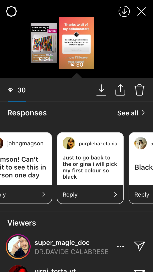
The voting process for the artwork was carried out over various social media platforms with each day’s results being painted every morning for thirty six days. As the work progressed past its second week, some interesting patterns began to emerge despite the obvious nature of chance (namely the diagonals that radiates from day 19). Consequently, my thoughts ran to politics and how voting intentions etc. are often analised to the point of visual exhaustion (during election campaigns for example). The manic search for political significance is symptomatic of any poll in that they merely express opinion, but seeing as this artwork has no purpose (other than itself and its own completion) it raises some questions about the power of decision when related to a largely pointless activity. Were my collaborators choosing purely on the basis of aesthetic value or were there other things in play?

A further point to make at this juncture relates to the title. ‘First past the post’ is a political system whereby the first party to achieve a overall majority wins, thus rendering the remaining votes largely irrelevant. The title is a pun on this concept given that all of the votes were gathered through social media posts.

Some screenshots of the voting process

Summary

“A blind man can make art if what is in his mind can be passed to another mind in some tangible form” - Sol LeWitt

I enjoyed producing this work because I had relinquished all control regarding what should be done. For sure, I came up with the rules, the colours (straight from the tube) and the overall style of the piece but not its actual content. As a result, the lack of judgements regarding composition makes it an exponent of Process Art; a way of working which puts how something is made above the end product. To that effect, ‘First Past the Post’ has reaffirmed that my work should continue to go in this direction; the involvement of other people (albeit in this virtual form) gives each individual work a very different feel, despite each one beginning as a set of rules. I also find it interesting that some have now contributed to more than one piece; which now begs the question “Who is the artist?”

Thanks go to:

A.Fitzgerald, C.Pomes, A.Leone, A.Turner, S.Collura, K.Richards, S.Abate, V.Torta, Snitch Publishing, M.Druet, K.Horden, D.Partington, V.Janmeijs, M.Borelli, M.Vickers, B.Newsome, J.Ledger, P.Thomas, L.Leone, D.Vickers, F.Halliday, B.Vickers, R.Magson, J.Inglesi, J.Magson, A.Mew, B.Smith, M.Denitto, J.Lawrance, P.Vickers, M.Kunstler, J.Smith, R.Vickers


A tribute to John Baldessari

No title

550 x 250 mm

Vinyl on polythene

Torino 2020

January 2nd brought the sad news that John Baldessari died at home in California aged 88. I have always considered him a huge influence, not just in terms of his varied subject matter and visual presentation but also of how he thought about art.

For the most part Baldessari’s work always carries a sense of humour which quickly eradicates any sense of pretension. You only have to look at works such as “The Pencil Story” (1972) to see this in action; also, in this instance, the very fact that the idea is written out instantly reveals the concept in a very succinct manner. (see source link below)

Furthermore, it is obvious to note that any other visual parts deemed unnecessary are deliberately avoided. Certainly an interesting decision on the grounds of how something is made; staying honest to the idea is often difficult, especially if time elapses between conception and final work.

The sensibility of Baldessari’s work (especially during the late 60s-early 70’s) goes beyond the conceptual angle into the realms of graphics and advertising. I see the similarities stemming from how publicity picks up on details, quirks and things that break up the rhythm of everyday life in order to garner attention. Is there any huge difference between concept art and advertising in that they are both subliminal? You could argue this case for any artwork but it seems more evident in works such as Baldessari’s.

On to the tribute work. The question of originality came up whilst I was producing The Coincidences Project some time ago; one offshoot from this (that was never fully explored) was how artworks may appear the same even if produced by two different people in two different places.

This line of inquiry was ripe for a ‘Baldessarian’ take, so introducing text back into the work was vital. The as yet untitled piece introduces the term ‘Coincidentalist’ as a joke on the many ‘ists’ and ‘isms’ that the art world uses to classify thought. In order to strengthen the message, I decided to minimalise the work to such a degree that even the base for the vinyl lettering (MasterType Roslyn) is transparent.

Has, in fact, another artist made this before I did and for the same reasons? It is definitely odd when you do stumble across something which asks the same questions or at the very least looks similar. There has always been a debate about originality in art and how artists try to ‘own’ their own style but what does it matter if you’re oblivious.

RIP John Baldessari 1931-2020

Source: https://www.tate.org.uk/tate-etc/issue-13-...

Straight from the horse's ass (part 2)

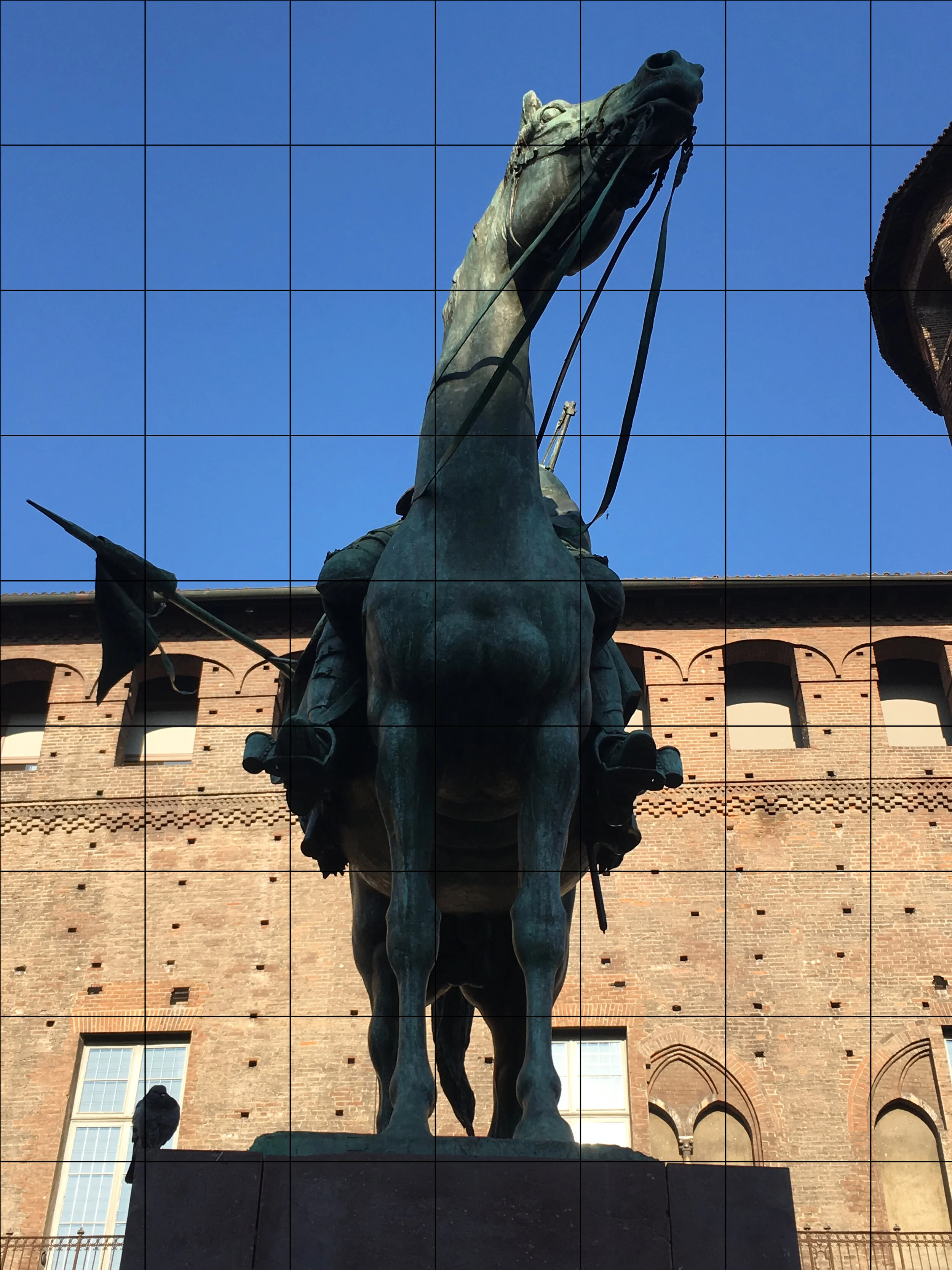
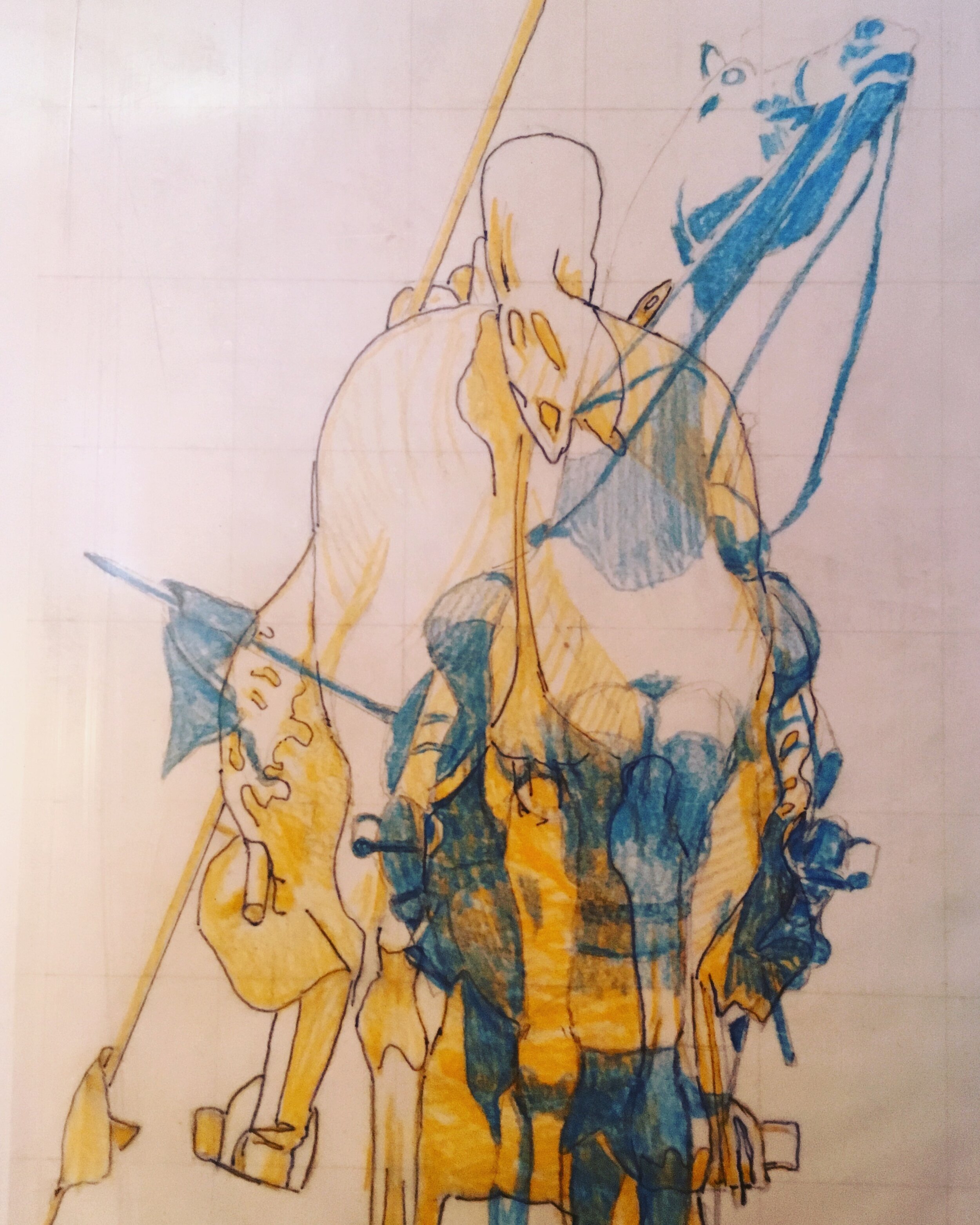
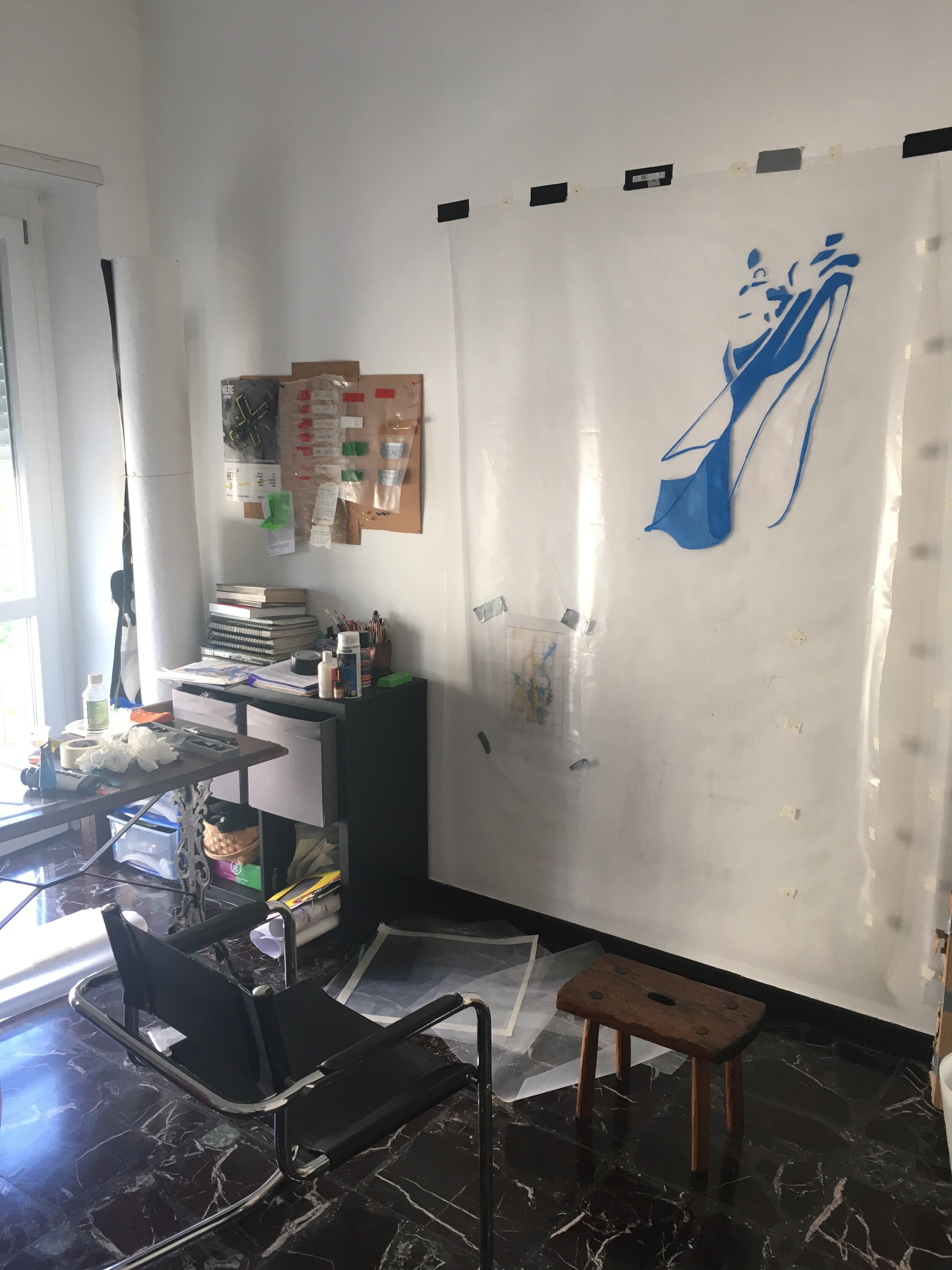
The concept took prescedence last week in part one, so I thought part two should contain some more technical details on the work but include some more insight as to how it is being made and why. The photos in the gallery (click to enlarge) are of the first piece in a series of five. They show the progression from the initial photograph to colour study and then full scale.

Speaking of scale, I found it essential to get as close as possible to a 1:1 (from the view at street level at least) to convey the uniformity that the chosen subjects have in the real world. Seeing as the concept is based on power, I found the decision to replicate and repeat entirely fitting.

The material is polythene, each of the five sheets measuring 2100x1500 mm. As painting on plastic is damn near impossible I had to experiment and produced a formula which I cannot disclose for obvious reasons.

When it came to the colour scheme (as you can also see in part one) the work relies heavily on the complimentary scale to represent duality. Contrasting colours such as blue and yellow speak of a number of different things, high on the list being political parties, moods or even personal preferences. However, the very nature of a clash, presented on two sides of the same object emphasises what people in power are inevitably conflicted by; that human nature often derails a principle.

The composition of each piece (as aforementioned) is based around the front and back of each monument. Due to the subsequent narrowness, each side makes an abstraction of the other (see part one for a better example) and the combinations sometimes give no real clarity on what you’re actually looking at. The blank areas on one side render the base layer of the other entirely visible and create an interesting dilemma on where to shift your vision.

In light of recent events in the UK; once the last part of this work is underway, the further political context of the work will be explored next week.