Seeing the Unseen
The Work of Hannah Merrill
Hannah Merrill is an American painter, collagist and printmaker who earned her BFA from Manhattanville College in 2009. Having taken her education further at the Aegean Centre for the Fine Arts she has gone on to exhibit internationally, namely in the United States, India and Greece. She now works from her home studio in Leeds, England; recently creating a delicate body of work that regards our spiritual origins, the presence of the female figure and has a strong penchant for environmental conscientiousness.
…….
“The process of making, for me, is communication…in a way that words can’t”
H.Merrill - March 2022
Any artist that presents their work with the door ajar as to how it is actually made, immediately asks the viewer a question such as this – is its physicality or imagination more relatable? On one hand, you understand that it has been ‘produced’ and some of your thoughts instinctively drift in that direction, whilst on the other you also know that there is something unsaid peering out at you. Hannah Merrill’s delicate but deliberately tactile work immerses you in that space where your mind gets stuck in the middle.
The paintings that make up the “Putting down Roots” series typify Merrill’s interest in the subliminal nature of the unknown. Each of these works has a metaphoric depth in more ways than one; not only can we see the earthy dominance of meandering root systems but we also have - especially in “Phases”, (2022) - the deliberate inclusion of the canvas’s previous life as an object. Such a decision to present the older versions under the paintwork reveals Merrill’s attitude towards zero waste and the notion of an artist’s work being the result of where they have been, what they have lost and more importantly, what they have kept.
On the subject of ‘the reveal’, the fact that Merrill has emigrated to the UK cannot be understated. Looking at things from an aesthetic point of view, it is fascinating to see how certain elements of ‘19th century subliminal Englishness’ have leaked into her treatment of decidedly more ancient subject matter. The interplay between the ethereal femininity and the harder, graphic quality of the natural world would not look out of place in William Blake’s “Songs of Innocence and Experience”- a work that embodies the struggle between man and the greater forces. Merrill’s work could also be described as illustrative and her preference for representing the unrelenting grandiosity of nature in small, page-sized works undoubtedly draws parallels to artists such as Blake. The recurring theme of the tree carries as much weight for her as it did for him, as it encapsulates that seemingly perfect natural form that either lives or dies at humanity’s whim. You could say that she uses the particular nature of lino print and its monochromatic starkness to reflect on our present environmental crisis. More importantly however, these prints are the result of seeing value in discarded material at the time of making. Given that the pages are chosen for their imperfections, each print reveals Merrill’s preoccupation with the dichotomy between how we perceive ugliness and beauty; ink stains, small creases and torn edges make up as much of the composition as the subject.
Comparisons to aspects of Romanticism and the Ideal can be seen in Merrill’s utilisation of the female figure, which appears frequently in the smaller scale pieces. Both “Earthbound” and “Clipped Wings”(2020) feature a woman with her back turned to us, showing an Icarus-like set of feathered wings. This everywoman represents the questions around the female in society, the male gaze and if sexually negative attitudes are either soaring or plummeting to the ground. She is not based on a real person, nor is she an intentional version of the artist herself but the figure does speak of the influence that theatre and performance has had on her recent work.
Having been involved with theatre at a younger age, there is a still a feeling within her collages that relates not only to the world of myth and interpretation but also to symbolically heavy devices - the swan and the moon for example - which have many different connotations for many people. Mythology and theatre have gone hand in hand for centuries and the pairing continues to recycle ancient stories for us to place into our own world. What is interesting about Merrill’s collages is that they utilise mixing and material choice to concentrate the authorless origins and shrouded truths of legend into a series of relatable, miniature backdrops.
What is certain is that Merrill’s work exemplifies the environment, storytelling and defining the indefinable. Each piece of paper, layer of paint or streak of ink talks of the importance of process within her work and how recycling fits into its overall meaning. Speaking of the future, it will be intriguing to see if one of the three main mediums under discussion here starts to exemplify the gap between reality and imagination more than the others. Will it be a repurposed lino-print? A new painting of an elemental enigma? A return to the everywoman?
Hannah Merrill has the potential to start a body of work that could come to represent modern day mythology – it might even already exist on her studio floor.
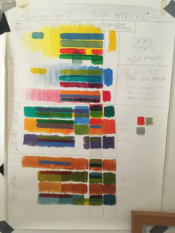
All images Copyright of the artist
Phases oil on canvas 2022
Earth bound collage/mixed media 2020
Wolf Moon collage/mixed media 2020