Essays / Exhibition news / Publications

Collected from an Exile - ATB Gallery

September 17 - October 5 / Via Riccardo Sineo 10 / Turin

Photo gallery of the private view and accompanying critical review by Alessandro Allocco, ATB founder.

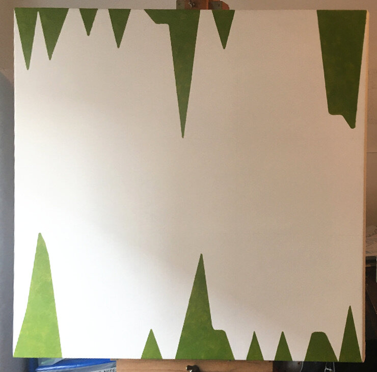
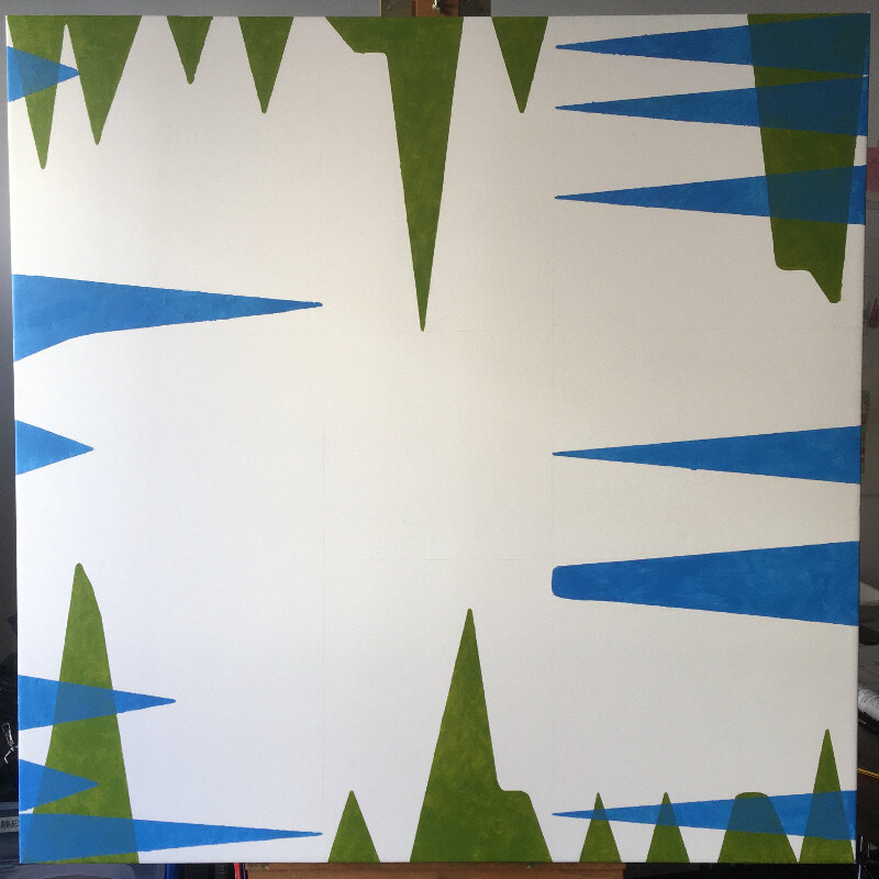
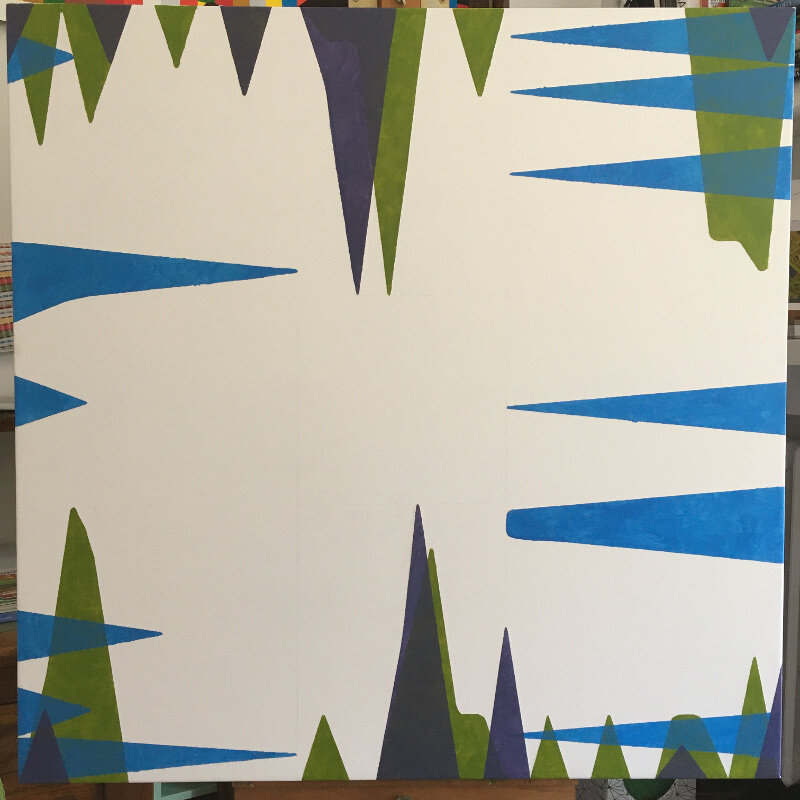
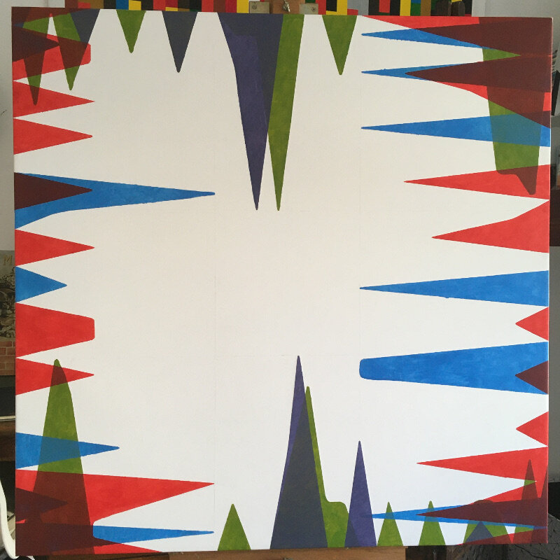
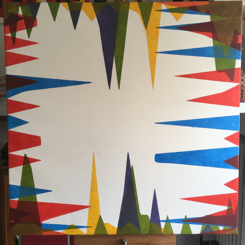
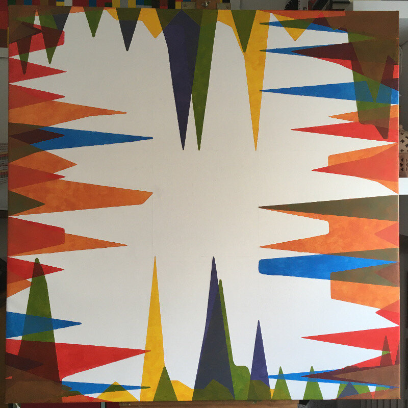
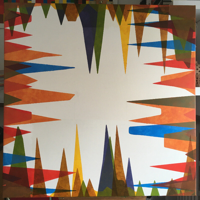
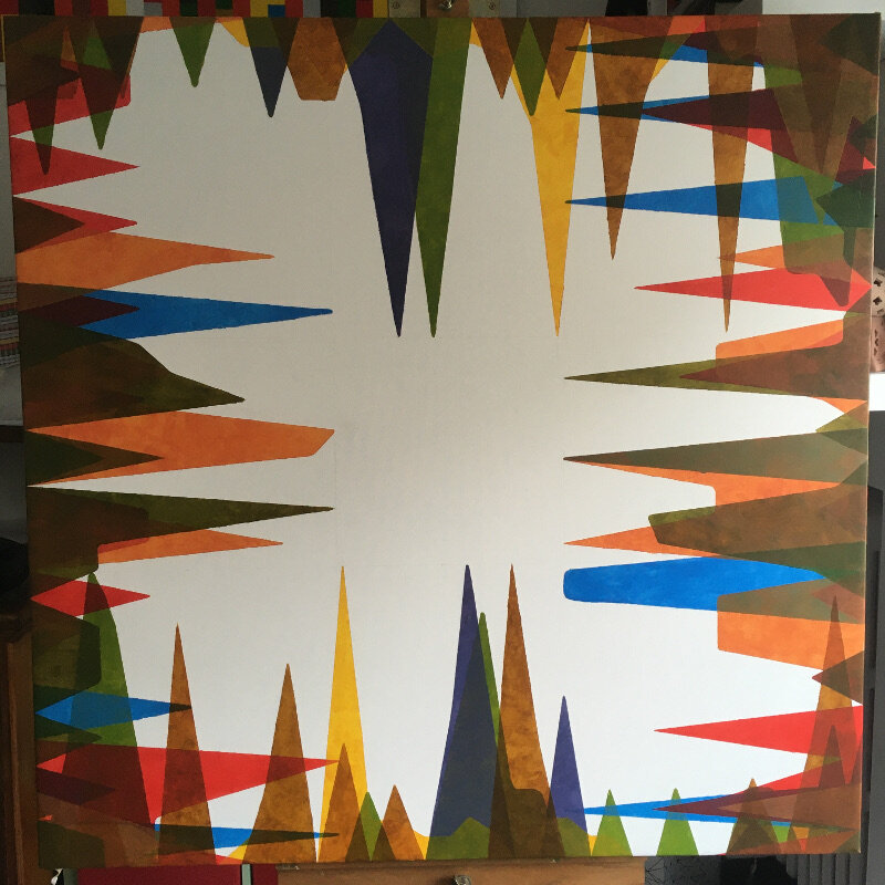
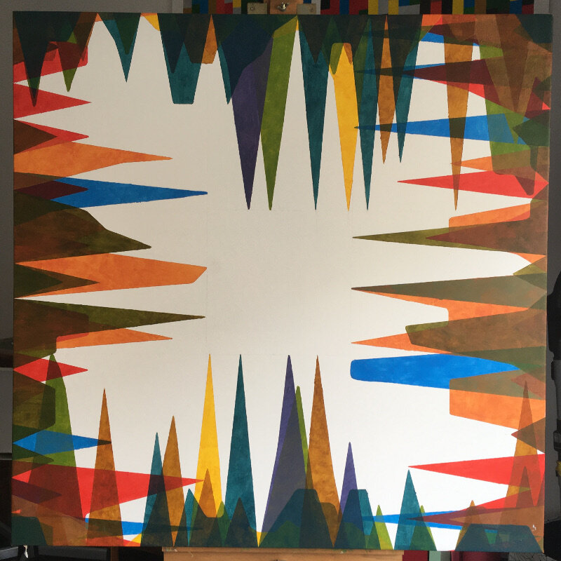
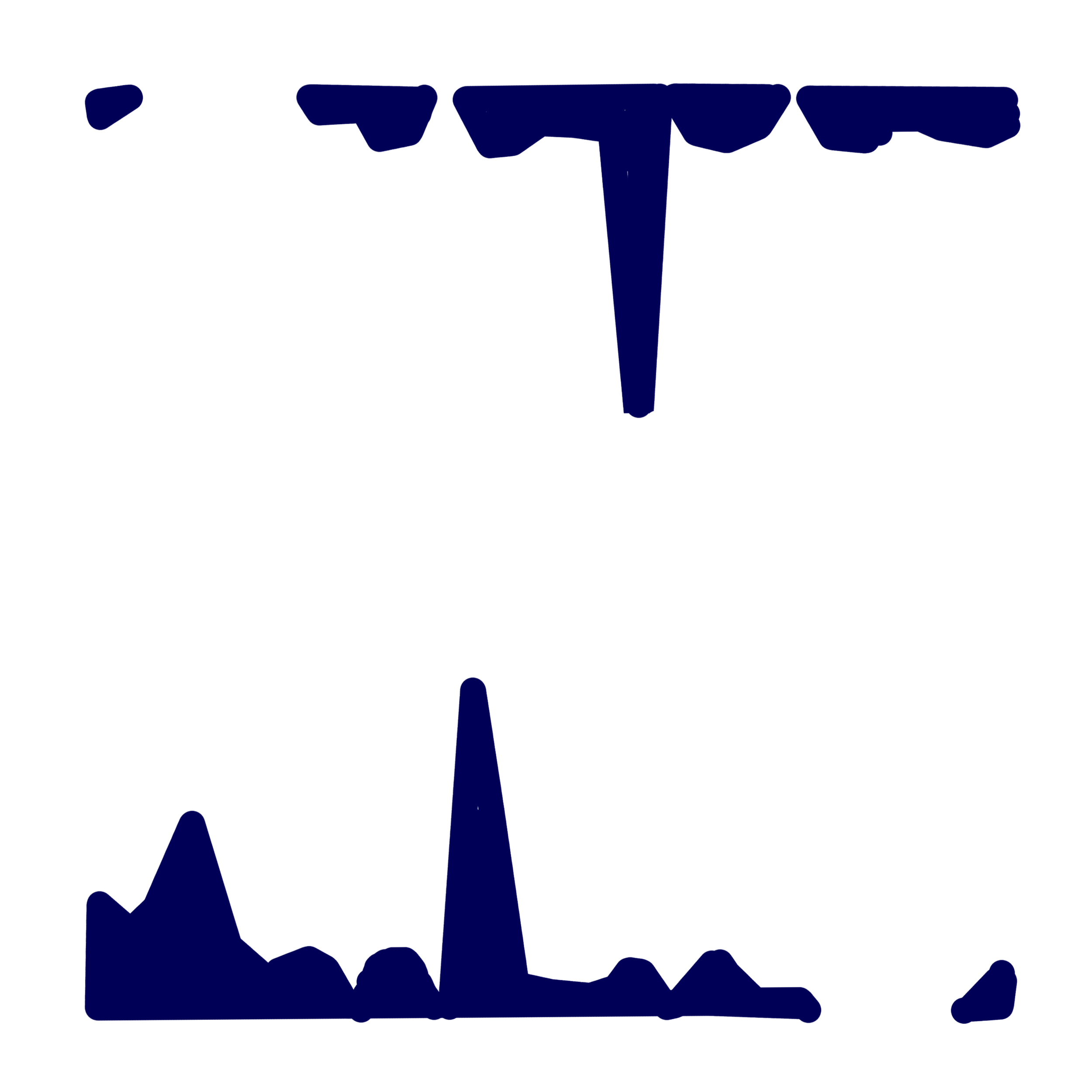
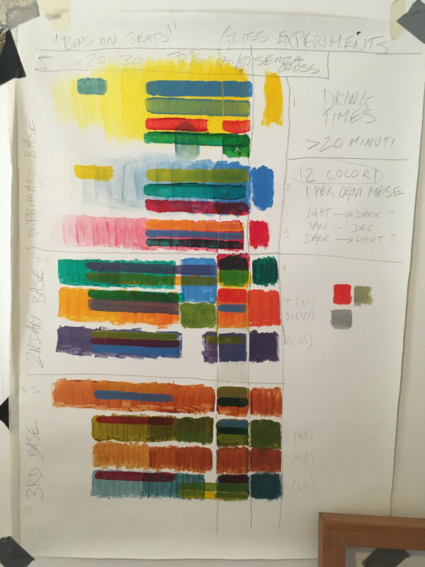
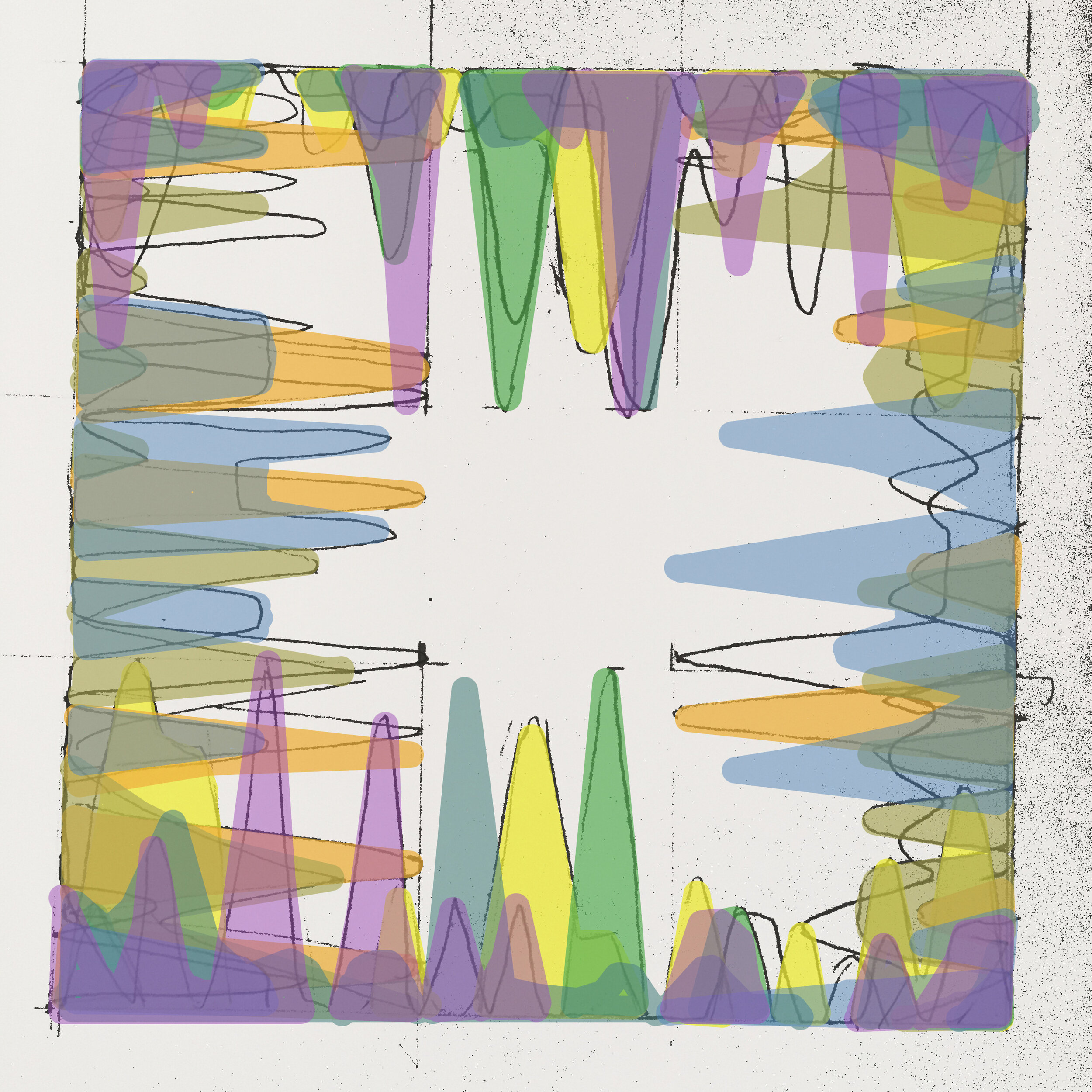
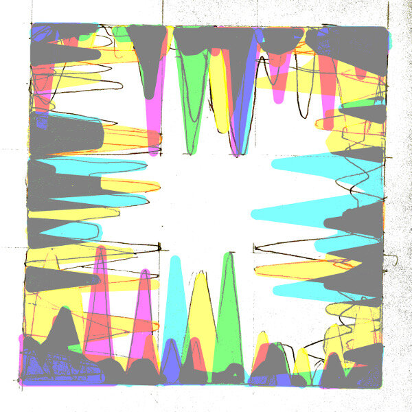
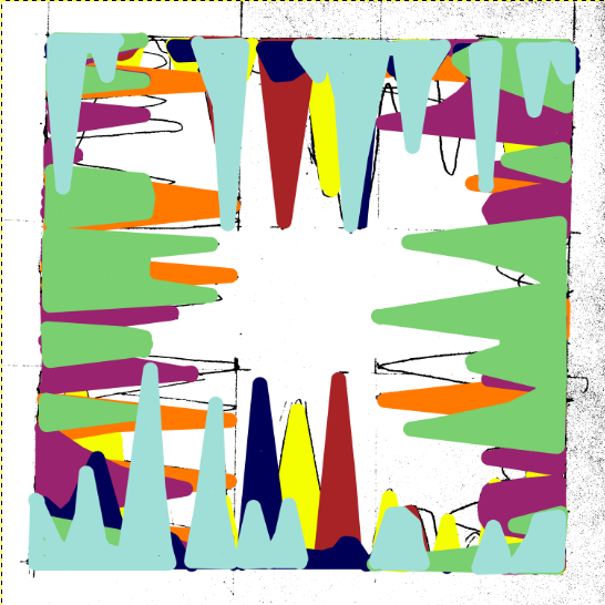
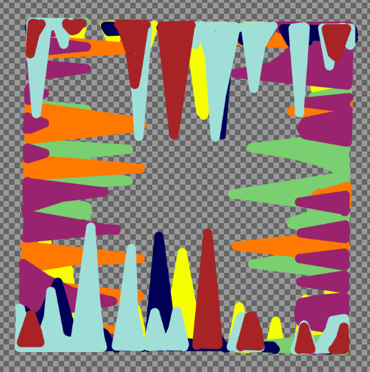
Works on show: Choice Material (2021), Bums on Seats, First Past the Post, The Dilemma, A Coincidentalist Work (2020), 14 Exposures (2018)

by Alessandro Allocco

Pure meaning, pure matter, poverty of subject, but the infinite richness of a staunch belief in the change of art.

 "Collected from an exile" is the work and result of Sam Vickers’ passionate research, exhibited at the ATB Cultural Association. It is an experiment of "non-art as art" in the age of social media. A series of interactive works based on time and the choice of materials that find their raison d'etre between conceptual emptiness and material value in constant fluidity of meaning - either full or devoid of emotional value depending on whether or not it falls within a market trend (in itself devoid of phatos, sensitive only to economic logic). Sam Vickers' works visually translate the need of perceiving art as a sign of effective change through coherent concepts inspired by social media. On his crusade into "exile", the British artist renews a pictorial language with the refinement of the material provocatively transformed only by time. The works on display, both material and social, are a concrete statement of the British artist's style. Sam Vickers seeks the avant-garde in the 21st century, as many of his fellow artists did in the 20th from Fontana to Burri, through the tendency to recognize matter’s fundamental meaning - that is no longer subordinate to the image being represented, as it is the very same protagonist of the work.

  Neodadaist artists such as Rauschenberg, Johns, and Nevelson or of Informal Art such as Burri, Milani, Somaini or even the Gutai group, are part of the circle of “matter” supporters but we can also find considerable interest that confirms this important artistic current in Surrealism and Futurism.

The first material paintings were made with clear provocative intentions of social denunciation: violent tears, disturbing black backgrounds or jumbles of fabric without a precise shape, but with symbols inherent to the historical context, jewels of undeniable charm that arouse curiosity and interest. "Collected from an exile" addresses a complex question - is non-art art? This concept is not new even if, in our western world today, the split between art and non-art is quite recent. There is a long history linked to the "everyday" (especially within modernist thought) in which the mundane provides  that "creative charge" so typical of contemporary artistic language. Sam Vickers’ works on display support "a cultural and holistic approach, above all non-ethnocentric, in the delineation of the process of construction of the ideas, practices and institutions of the arts ..." (Larry Shiner, The invention of Art. A Cultural History 2001).


The concept of non-art as art is linked to the new and improved social conditions of our opulent West, which have stimulated new tastes and aesthetic conceptions that are actually dissimilar to the academic achievements of the past: new places in which to experience and discuss poetry, of instrumental painting or music outside their traditional social functions, physical and virtual places, material and immaterial.

Equally, the concept of non-art as art cannot disregard the history of art through which it is perceived, namely to understand what our culture considers artistic there is a variety of time, place and social strata to consider; as well underlined by Picasso, who recognized art in African and Oceanic everyday objects (for work or otherwise: ritual masks, sticks, spears) and raised them to museum object status. He was right because beyond the system of social relations that art has always generated in culture and beyond the different ways and styles of formal creativity, aesthetic dimension is always proper to every human activity.

The concept of non-art as art is a commonly experiential element that affects all social levels because, after all, being artists is a fundamental characteristic of our species, it is a need and capacity encoded into our genetic memory, it is an elementary necessity of human beings constantly looking for fulfillment, satisfaction and ease, beyond mere utility.

The habit of considering art distinct from what is not currently dominant art in the West, is spreading further into the rest of the world and collects peculiarities of one’s own life as an artist, of unique pieces, of unerring research and the authorship of wonder. All that is called art is a cosmopolitan phenomenon that globally connects not only the markets of aesthetic products, but also many (if not all) local aesthetic dimensions that are, more or less, already "contaminated" - often consciously and programmatically hybridized with non-art.

  The exhibition "Collected from an exile" by Sam Vickers welcomes the two sides of art and non-art as art and treats them as complementary attitudes towards traditions and post-modernity; also making them part of a complex framework of hybridizations between local traditions, mass culture, experimentalist elitism - in an intrinsically "postnational" dynamic.


Bums on Seats Part VII - Artwork Review

It might have taken five months to execute but “Bums on Seats” is now finished. Five months you say?! That’s ages! Well, let’s be glad that it wasn’t twelve as the concept points out - a year of analytical data on canvas that represents the weirdly obsessive nature of being a virtually present artist. Parts one to six of this essay series cover the original ideas, developments and other such matters (so start there if you’re new to this) but this one is a review - so was it all worth it?

I think it certainly looks good; it’s quite close to what I had imagined back in August (gallery image 1) but the main observation would be that it now sits in a curious place between statistical exactitude and layered abstraction. The balance between the monthly colours was planned to flow from green back to green again (each one being a slightly different tint from the last) but threw up some difficulties in getting the right levels of medium transparency. But that’s just technical really- the overall effect is in keeping with its purpose.

The negative space works well and certainly reveals some patterns as to how my website is working. It has been perplexing to see people going mad for it one day but quieter than Hillary Clinton’s victory parade the next. One regret is not introducing some indicator of geography for “Bums…” which could have added extra meaning to it but nevertheless, it’s evident from this work that the site is at its hottest in the middle of the month. Do bigger numbers make you a better artist? Do lower ones make you a bad one? It’s a very modern dilemma but one that I hope that this work raises.

Working on canvas again after such a long time would be another positive that I can take from this piece. In fact, to have one hanging on the wall makes a refreshing change (gallery image 7) and producing a more subtle yet varied colour palette was fun (as opposed to “First Past the Post”, which was a straight from the tube affair).

I’m also happy to announce that “Bums on Seats” will be exhibited at the upcoming Fourth Edition of the Virtual Art Fair. Opening January 29th Curated by Lucy Fiona Morrison

Web link thevirtualartfair.co.uk/

Instagram @thevirtual.artfair

Bums on seats Part VI (Killing-time based work)

Many artists that I have spoken with would have heard me state that work needs to be finished quickly in order to avoid stagnation. Any protracted length of time allows your visual certainty to slowly escape like air from an unattended bike tyre, leaving you with more questions to answer than the singular one that got you started. This is something to be avoided at all costs. Yet there are some who embrace it, making time the essence of the work; the photographers, for example, that take the same kind of image every day for ages, portraits of themselves or their kids or whatever. In most cases, it’s some banal activity that represents a period of controlled creation, the length of that period usually being the most interesting thing about it.

“Bums on seats” is lazily drifting into that category. I’m at the mercy of the system that I myself produced and it now feels like more of a ‘killing time’ based work than anything else. The data from October is in and transferred to canvas but nothing can be laid down until the end of the month- it would skew the results if I did. Coming up with a time based work halfway through the period that you intend to record puts you in a ridiculous situation when you catch up with yourself. It’s similar to when you exceed the allotted skips per hour of a certain audio service and then having no choice but to endure whatever dross they give you.

In any case here’s a review of the work month by month. It’s interesting that each colour is still largely discernible, even if the layers have started to blend into each to form a brownish blue. Schematically speaking, the plan is to paint the December results in a colour close to the bright green of January; thus representing the Internet’s never ending stream of information.

Bums on Seats Part IV

This week is all about colour. Yes I know, colour theory has been done to death but I feel that it’s important to consider it- especially following my recent works “First Past the Post” and “Straight from the Horse’s Ass”. I would also say that because I haven’t worked on a painting for a while (in the traditional sense) it serves as a reminder to not make any schoolboy errors. Experimentation is all well and good but the wrong choices will confuse everything. Or will they?

Up to this point the work has been mainly talking about the progression of time and the obsessive nature of your own online presence. So how do these abstract concepts relate to a colour scheme?

In truth it’s all down to interpretation; would I consider a month with crap viewing figures as being a cold colour? Or alternatively, would a green or a blue indicate a calmer feeling of, “oh well last month went alright so I don’t need to worry about it...”? On the flip side, warmer colours mean something different but essentially carry the same set of  contradictions. It’s a bugger alright.

Christ, don’t trip over your laces on the starting line, it’s only colour, they’ll fade over time anyway- which does in fact lead me into the next point. I mentioned the passage of time earlier and this work (which will account for a year’s worth of analytics) represents how something as trivial as a statistic is all consuming but is then quickly overtaken by the latest data set. In the gallery below are some of the tests that I have been doing, beginning on canvas. In the later versions, even though the simple progression around the colour wheel can be digitally altered to any preference, it’s interesting how complimentary colours cancel each other out even in a computerised simulation.      

The acrylic tests include some experiments with opacity using a gloss medium as a thinner. I would say that I’m unsure about which is the best ratio but in any case it felt like I was painting with dead expensive shampoo or conditioner- not ideal! However, translucency is something I should explore further as it gives the image more depth and would make a change from the block colours of the previous works.

Next week: preparing canvas ……..YAWN…… but seeing as I’m writing about everything…