Amongst the endless grid copying, papier mâché body parts and the big hitters, the one unifying thing that people seemed to do in art at school was a pencil drawing of a shoe. I recall two or three being brilliantly exact, photo-realist masterpieces, some half-decent to middling efforts, a few were more joyously cartoonish whilst others merely resembled dead slugs or something else that was clearly not a shoe. We put them all up on the wall and had a good laugh at the really bad ones, whilst the teacher stood back, desperately scanning for any glimmers of talent. I guess that the exercise was to try and represent something that you knew inside out on a crappy sheet of A4 - a non-art object as a symbol of your way of thinking.
Read MoreEssays / Exhibition news / Publications
Bums on seats Part VI (Killing-time based work)
Many artists that I have spoken with would have heard me state that work needs to be finished quickly in order to avoid stagnation. Any protracted length of time allows your visual certainty to slowly escape like air from an unattended bike tyre, leaving you with more questions to answer than the singular one that got you started. This is something to be avoided at all costs. Yet there are some who embrace it, making time the essence of the work; the photographers, for example, that take the same kind of image every day for ages, portraits of themselves or their kids or whatever. In most cases, it’s some banal activity that represents a period of controlled creation, the length of that period usually being the most interesting thing about it.
“Bums on seats” is lazily drifting into that category. I’m at the mercy of the system that I myself produced and it now feels like more of a ‘killing time’ based work than anything else. The data from October is in and transferred to canvas but nothing can be laid down until the end of the month- it would skew the results if I did. Coming up with a time based work halfway through the period that you intend to record puts you in a ridiculous situation when you catch up with yourself. It’s similar to when you exceed the allotted skips per hour of a certain audio service and then having no choice but to endure whatever dross they give you.
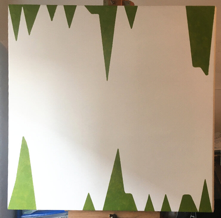
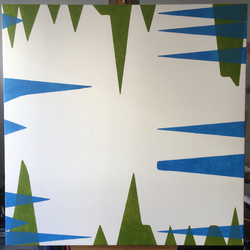
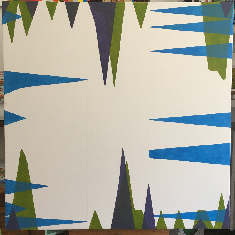
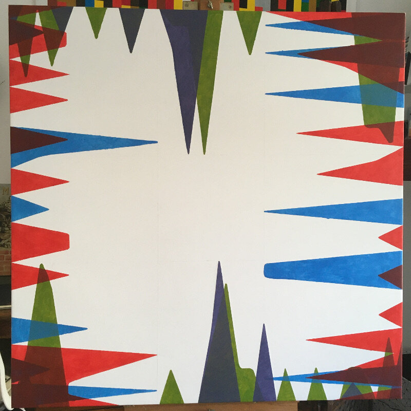
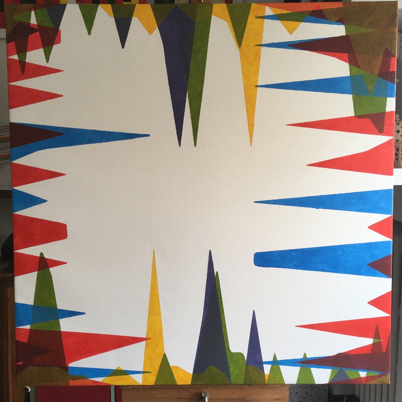
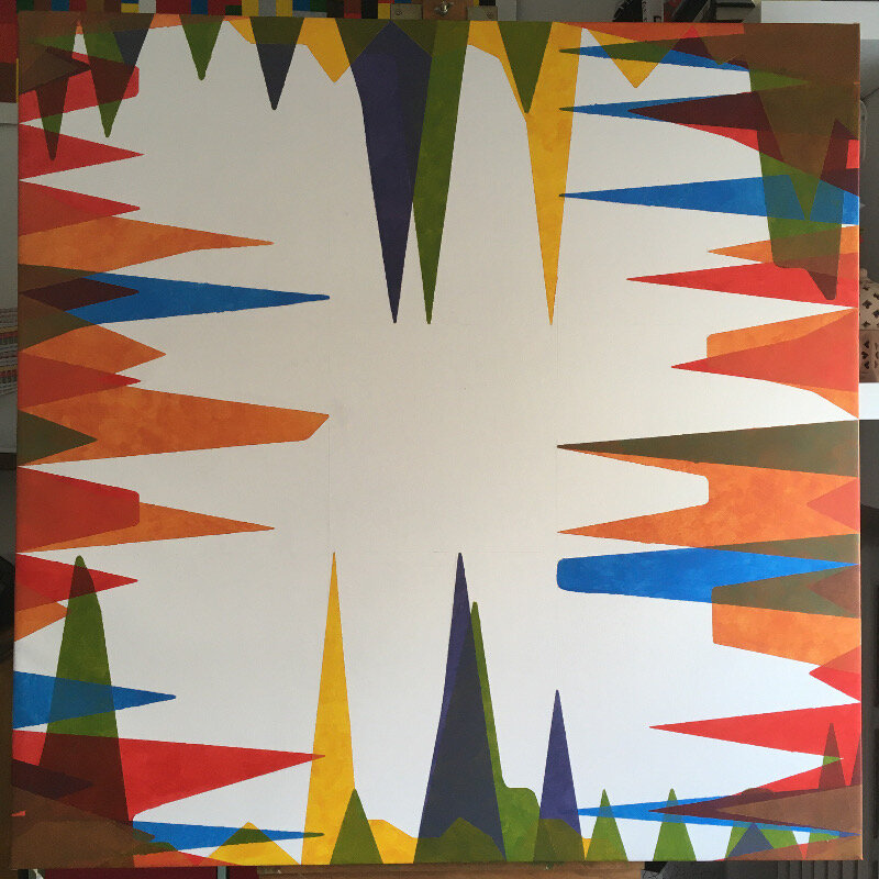
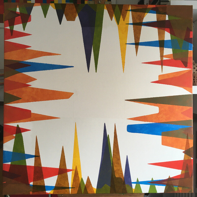
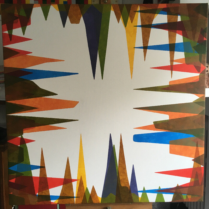
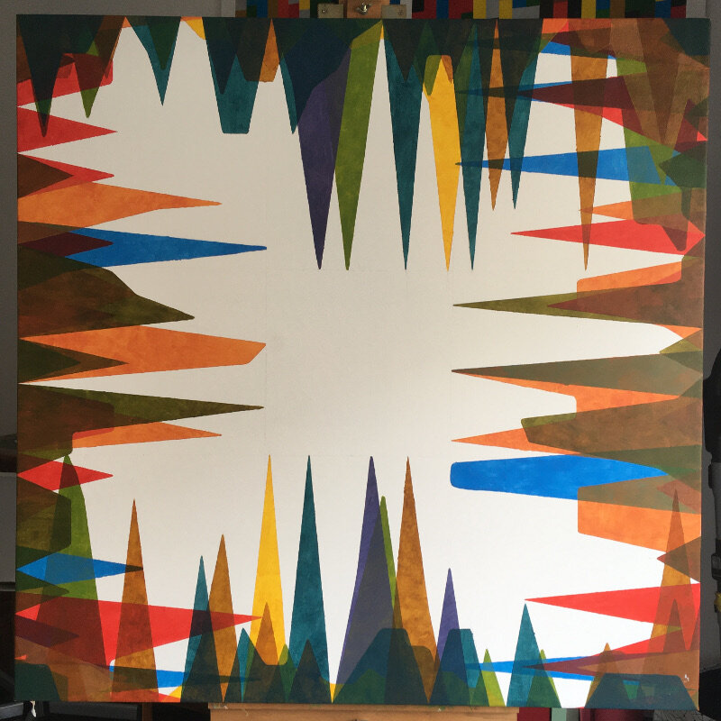
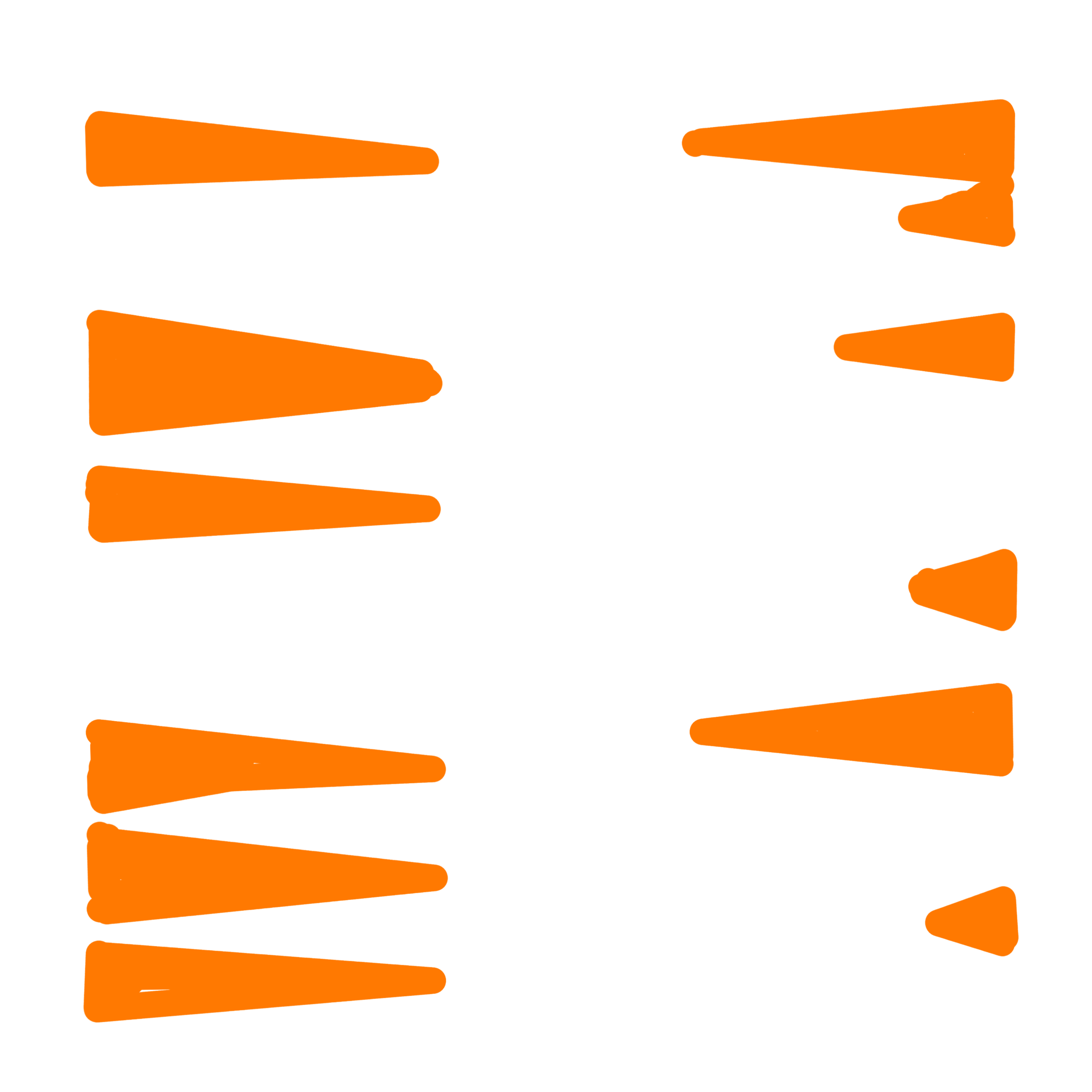
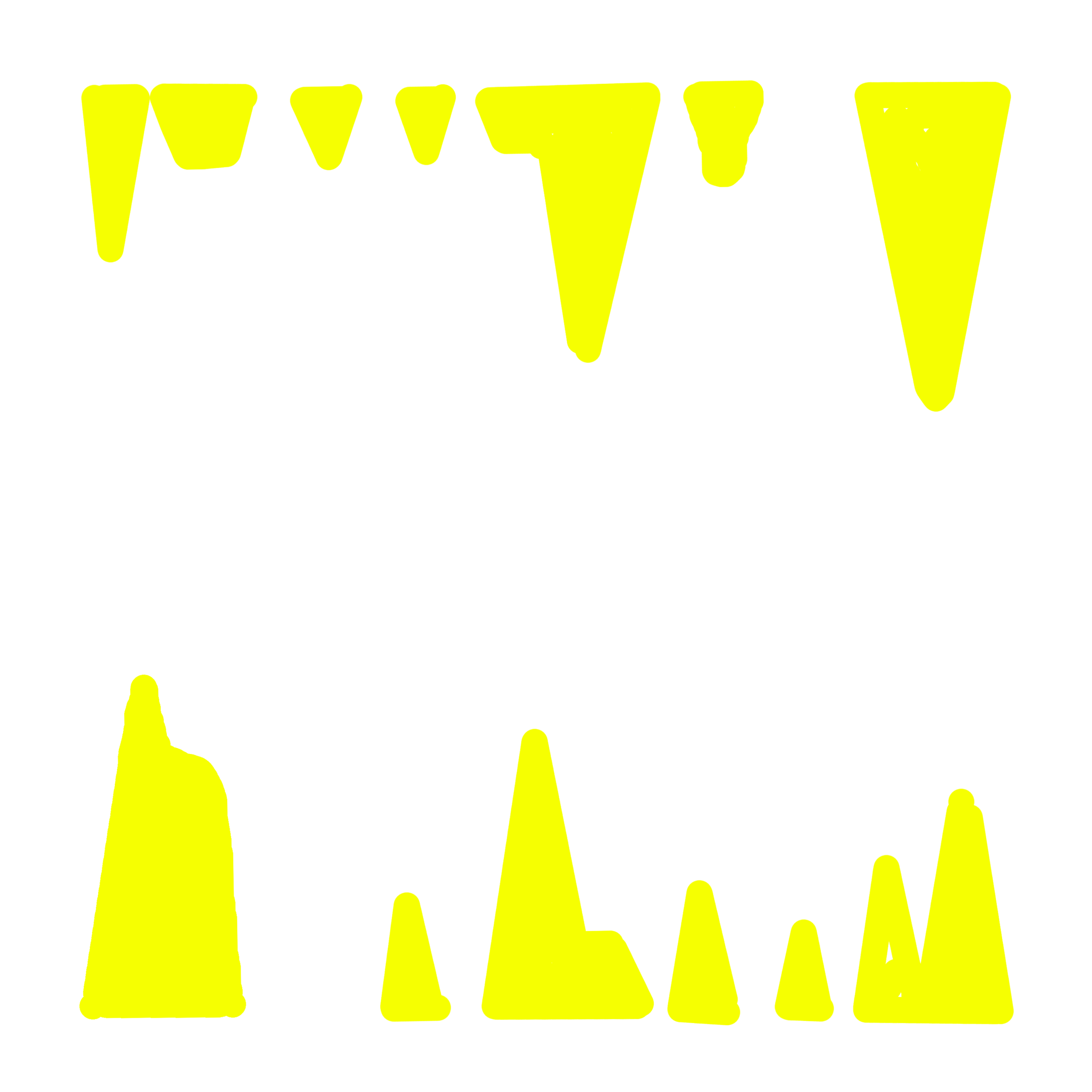
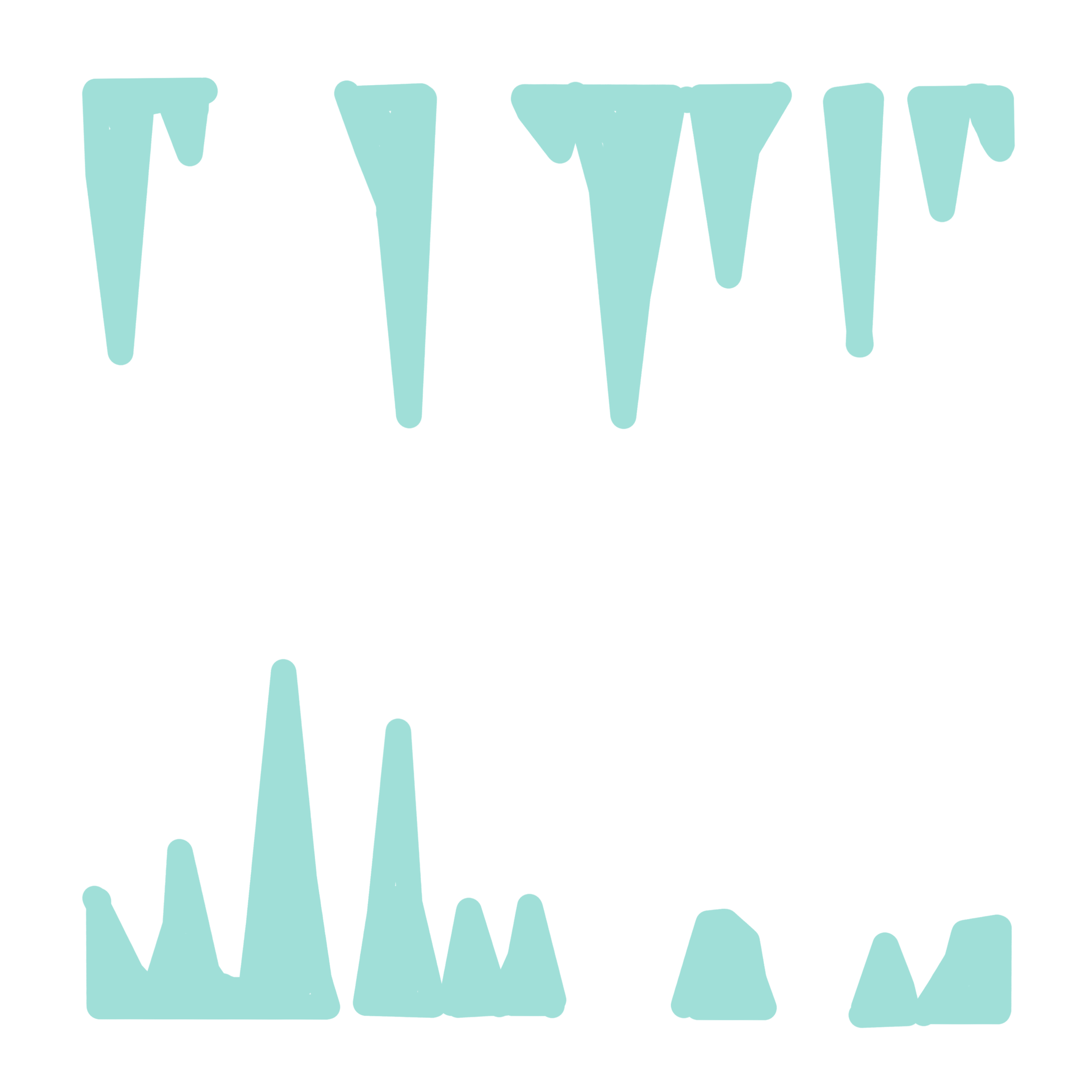
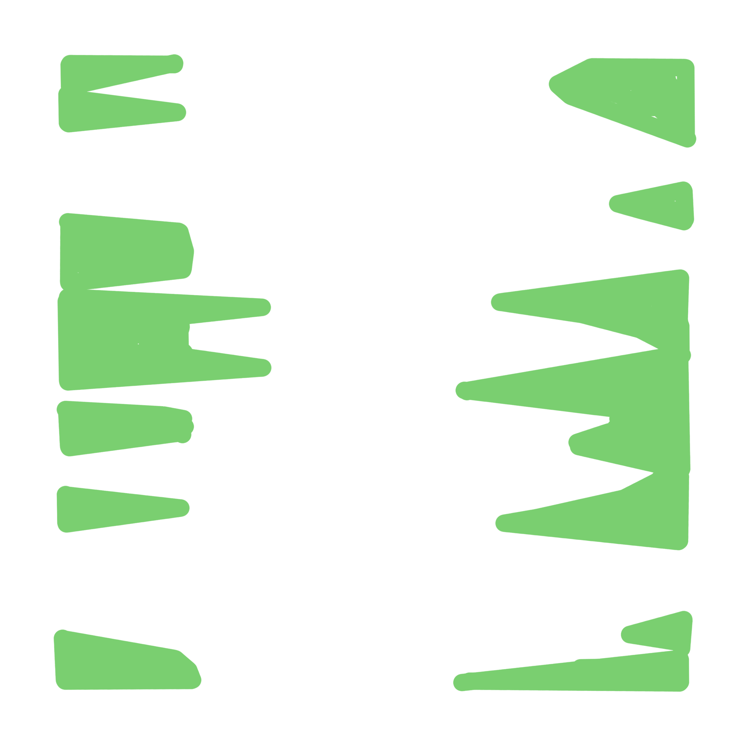
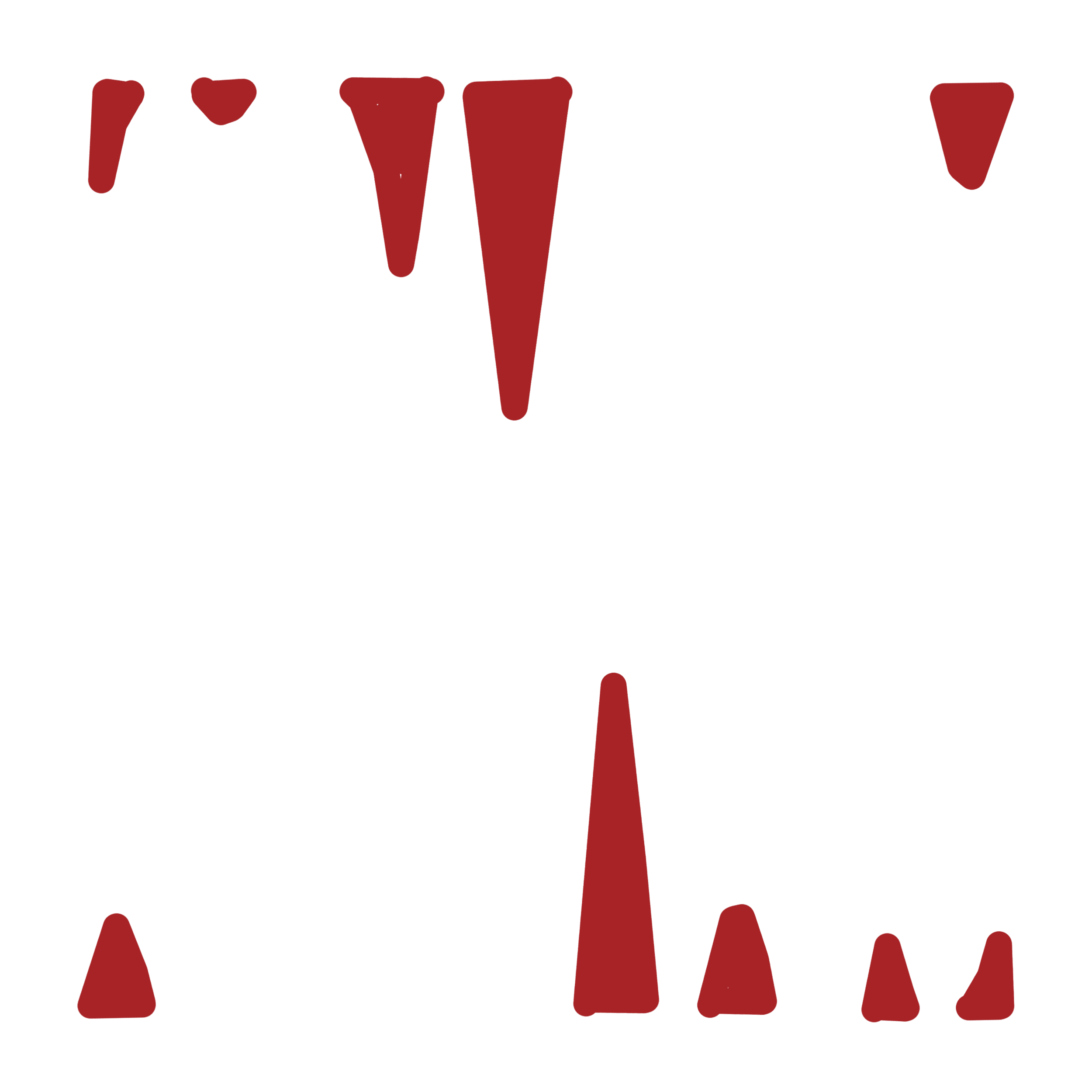
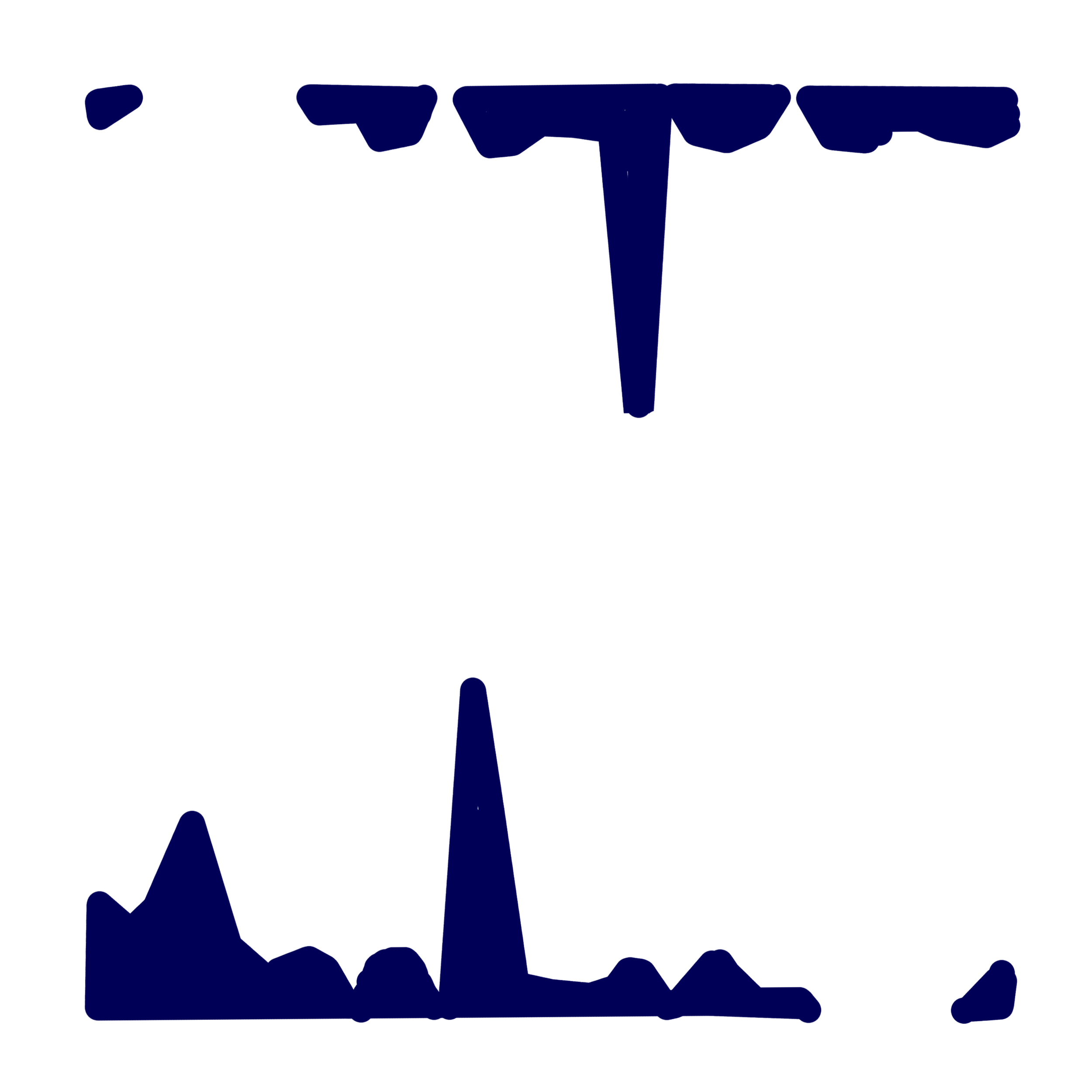
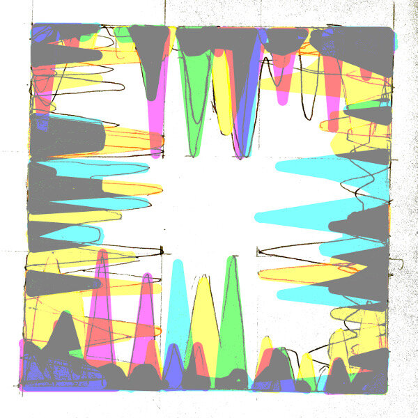
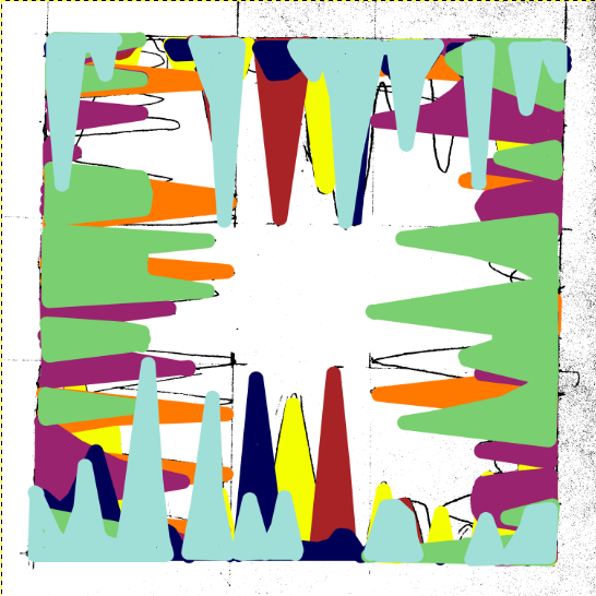
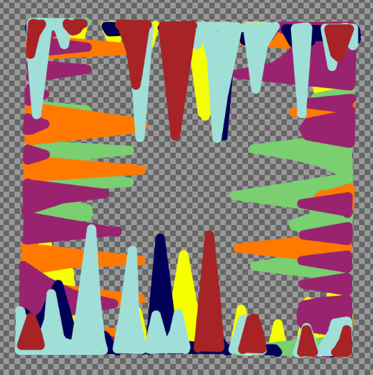
In any case here’s a review of the work month by month. It’s interesting that each colour is still largely discernible, even if the layers have started to blend into each to form a brownish blue. Schematically speaking, the plan is to paint the December results in a colour close to the bright green of January; thus representing the Internet’s never ending stream of information.
Bums on seats Part V (goodbye base camp)

It seemed a shame to ruin it really, this satisfyingly square first attempt at a canvas. Last week’s fear over what to do next turned into what I can only describe as a modernistic inertia, as it sat in the studio waiting to be defiled. I had built it up too much; that first gestural mark felt like it had to encapsulate everything that I’ve written about so far: the internet, attention culture, the old theatre crowd, colour theory and the death of interest. All things considered, this reluctance is the down side of having a clear concept in mind, there could never be anything spontaneous or automatic about this work, otherwise it would be a stab in the back- if only with a paintbrush. Yet, working to a plan gives a visual idea some semblance of intention and meaning, especially when something as flippant as colour comes crashing into the room; such a thing can throw you completely. A plan honours the original idea; if something stuck out in your mind as being better than something else in the beginning, then why not try to stay as close to that moment as possible?


I have said many times before that my work comes from the concept, a contextual version of base camp if you will. The best route, potential hazards and the appropriate equipment all depend on what’s decided over bacon and eggs- how do we get to the top without dying or losing sight of why we’re even here? They say each mountain climb is different and that goes for making art too but to continue this ‘lofty’ analogy would give you altitude sickness sooner or later so let’s get to the point- the interesting thing about “Bums on Seats” (working title) is that it carries on from “First Past the Post” and “Straight from the horse’s ass” in the sense that they are all rigorously planned, painted abstractions that represent a system. I say interesting because producing three examples of similar work in close succession is strange for me- I should be bored with it by now.
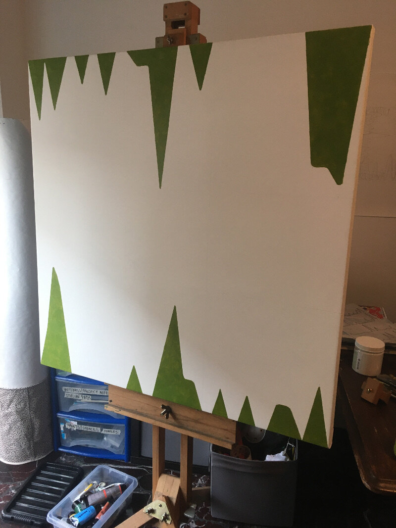
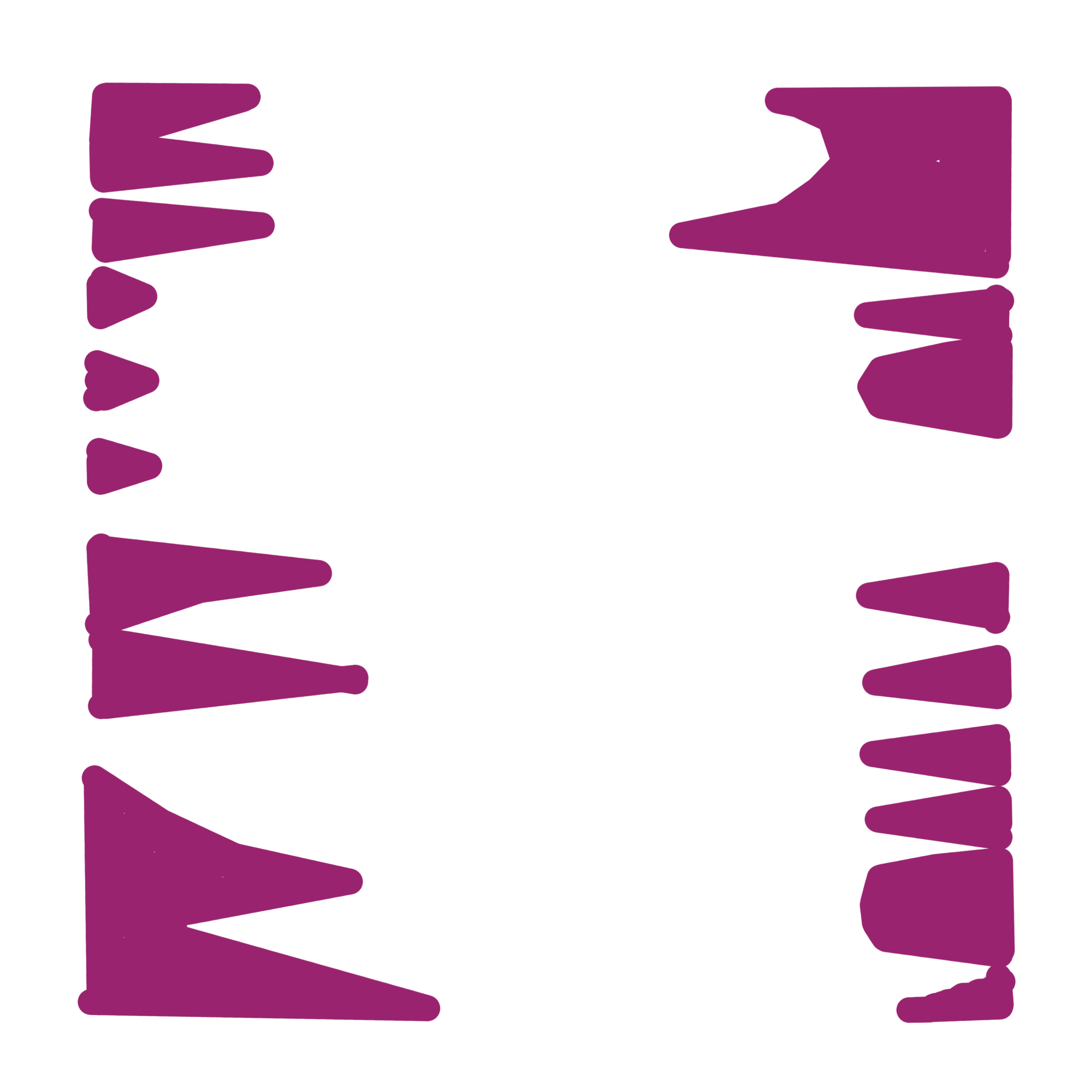
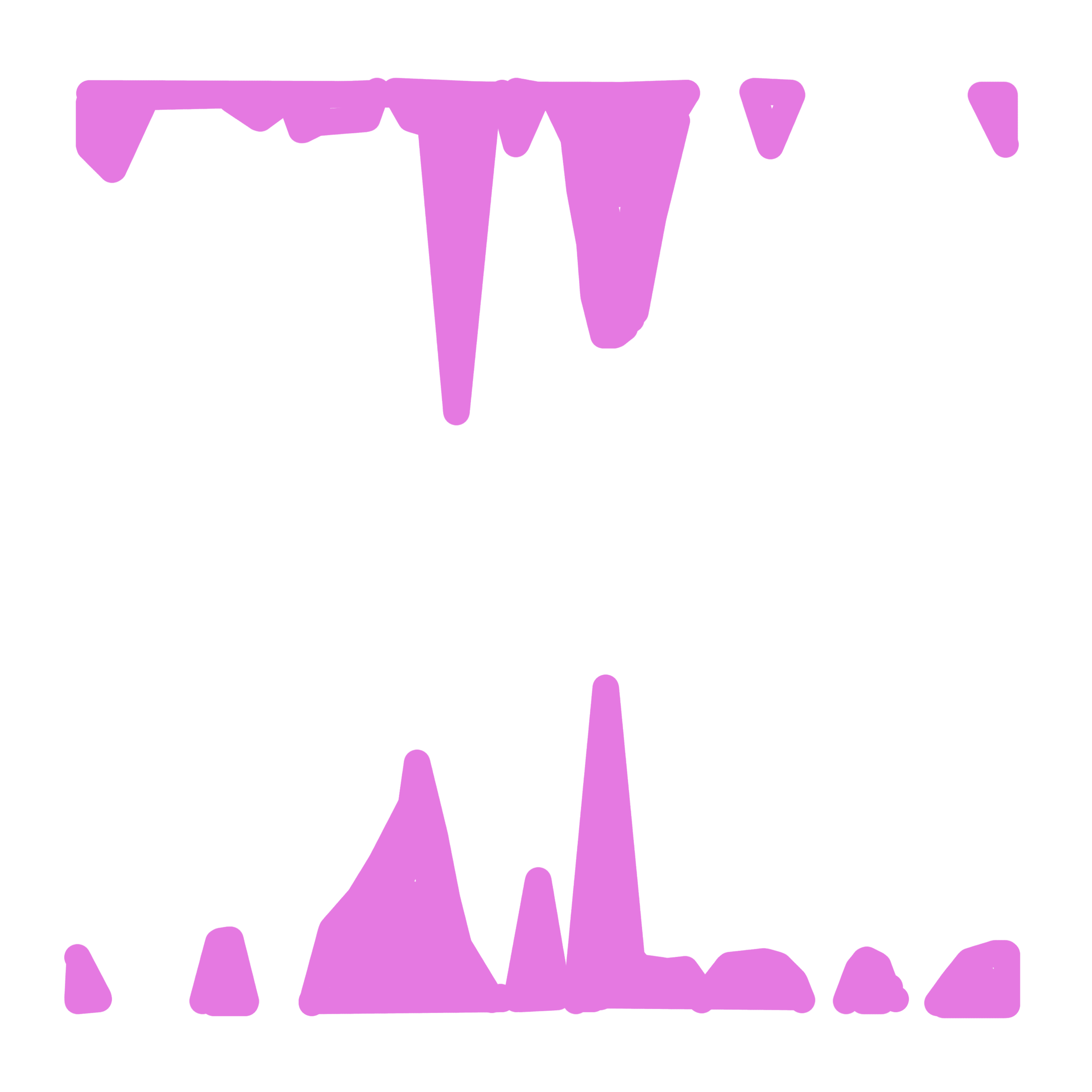
Onto the painting itself- I have started out with the data that relates to January and February. The composition relies on each edge of the canvas serving as the original x axis and the centre as the void that the subjects try to reach into. I’m looking for some balance within the painting so the matching colour spikes (relating to page views, visitors etc) will mirror each other from opposite sides. After conducting some experiments recently I am choosing colours that worked, or at least complimented or blended into each other to form a range of darker tones. As the layers become more complex I hope to see some colours either dominate or fade at first glance (in the same way that visitor hits from earlier this year barely seem relevant to what’s happening now, even if was an impressive statistic at the time).
My knowledge of oil paint is sketchy at best so this piece is being made with gloss medium and acrylics. Using the former would be like going up K2 without any decent boots…
Bums on Seats Part IV
This week is all about colour. Yes I know, colour theory has been done to death but I feel that it’s important to consider it- especially following my recent works “First Past the Post” and “Straight from the Horse’s Ass”. I would also say that because I haven’t worked on a painting for a while (in the traditional sense) it serves as a reminder to not make any schoolboy errors. Experimentation is all well and good but the wrong choices will confuse everything. Or will they?
Up to this point the work has been mainly talking about the progression of time and the obsessive nature of your own online presence. So how do these abstract concepts relate to a colour scheme?
In truth it’s all down to interpretation; would I consider a month with crap viewing figures as being a cold colour? Or alternatively, would a green or a blue indicate a calmer feeling of, “oh well last month went alright so I don’t need to worry about it...”? On the flip side, warmer colours mean something different but essentially carry the same set of contradictions. It’s a bugger alright.
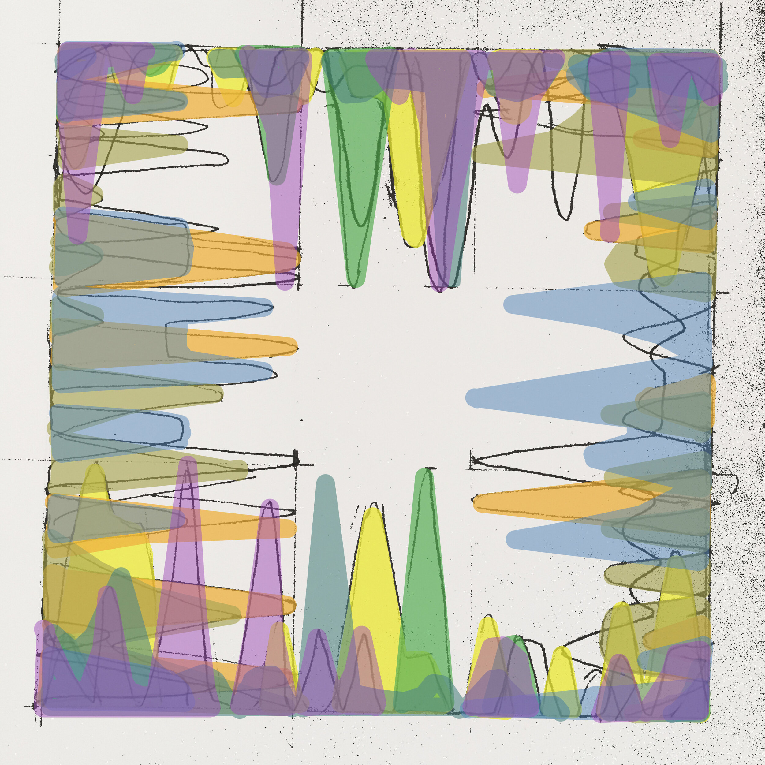
Christ, don’t trip over your laces on the starting line, it’s only colour, they’ll fade over time anyway- which does in fact lead me into the next point. I mentioned the passage of time earlier and this work (which will account for a year’s worth of analytics) represents how something as trivial as a statistic is all consuming but is then quickly overtaken by the latest data set. In the gallery below are some of the tests that I have been doing, beginning on canvas. In the later versions, even though the simple progression around the colour wheel can be digitally altered to any preference, it’s interesting how complimentary colours cancel each other out even in a computerised simulation.
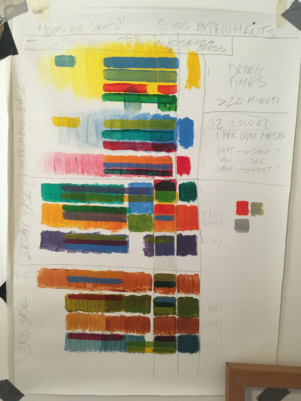
The acrylic tests include some experiments with opacity using a gloss medium as a thinner. I would say that I’m unsure about which is the best ratio but in any case it felt like I was painting with dead expensive shampoo or conditioner- not ideal! However, translucency is something I should explore further as it gives the image more depth and would make a change from the block colours of the previous works.
Next week: preparing canvas ……..YAWN…… but seeing as I’m writing about everything…
Bums on seats dear boy! (art in the age of analytics) Part III
From an artist’s point of view, your virtual presence is now dictating how others perceive your work more than ever. No decent website, no decent artist.
Onto the work I have been developing over the last fortnight…
Read More