Essays / Exhibition news / Publications

Raccolta da un Esilio - ATB Gallery

Settembre 17 - Ottobre 5 / Via Riccardo Sineo 10 / Torino

Galleria fotografica dalla vernissage e una fantastica recensione critica di Alessandro Allocco, fondatore di ATB.

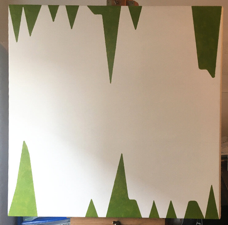
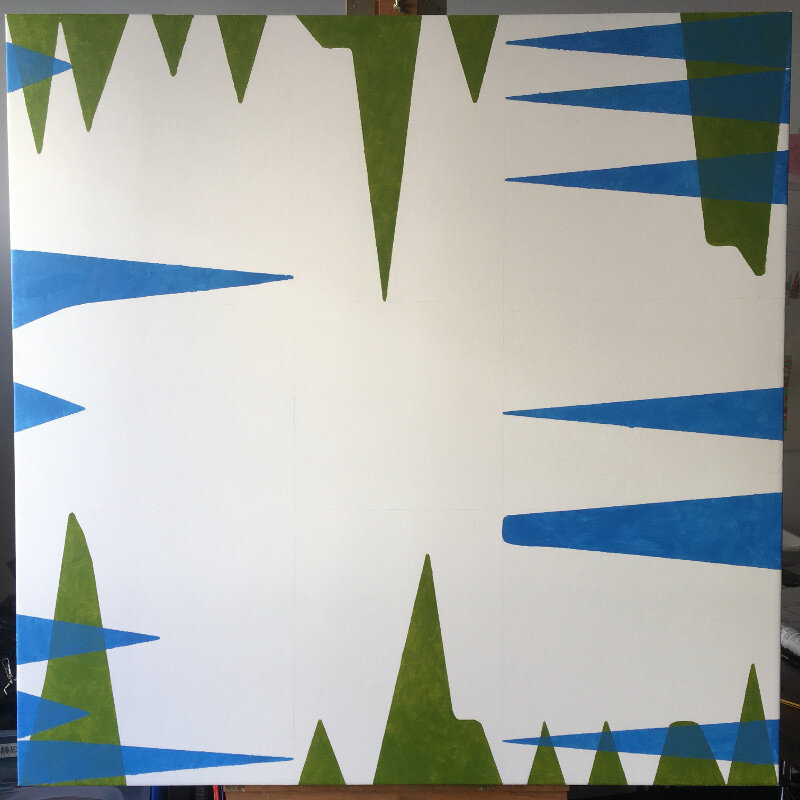
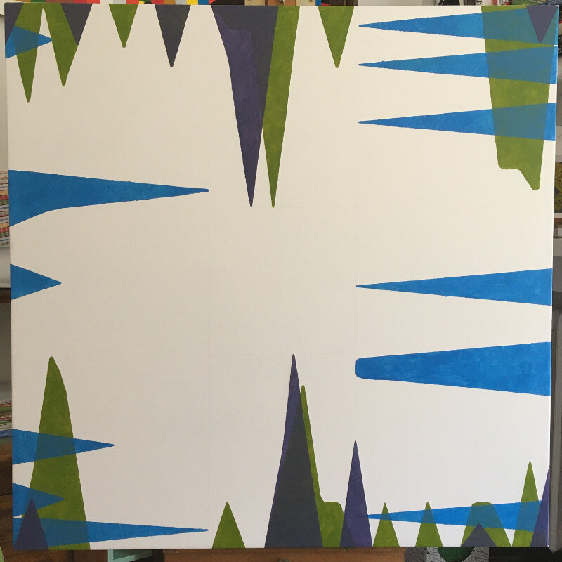
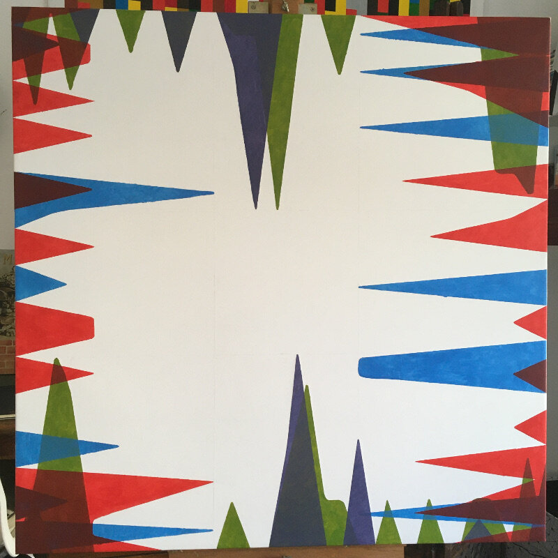
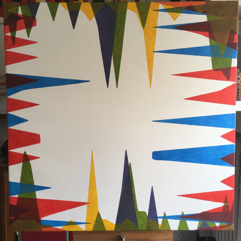
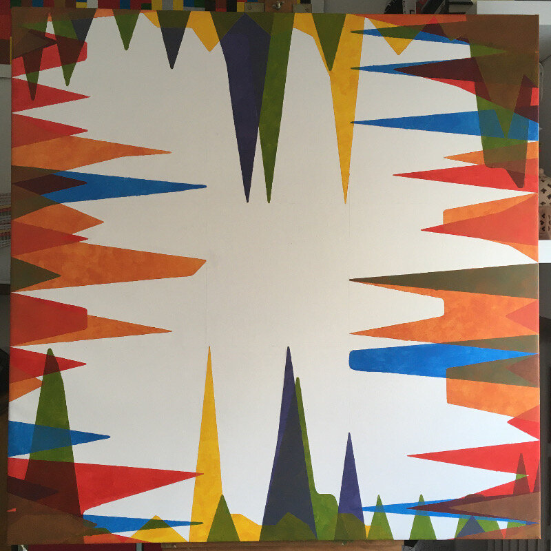
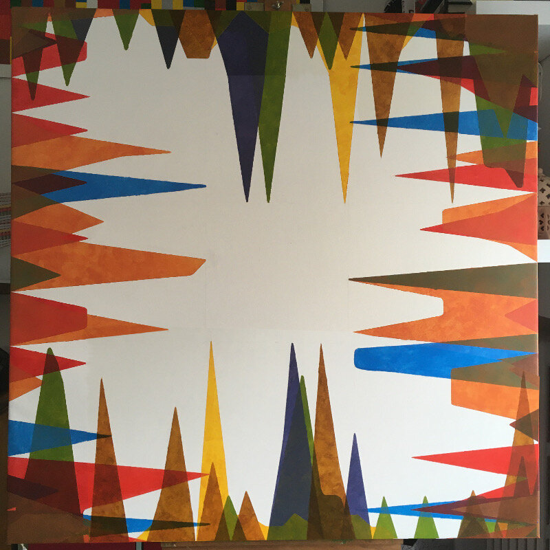
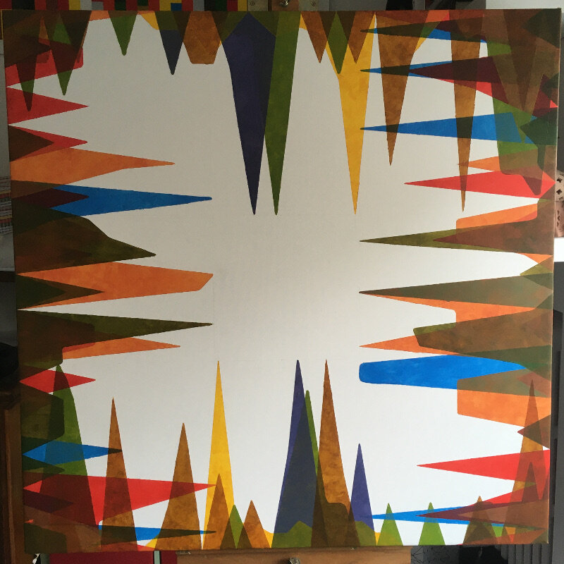
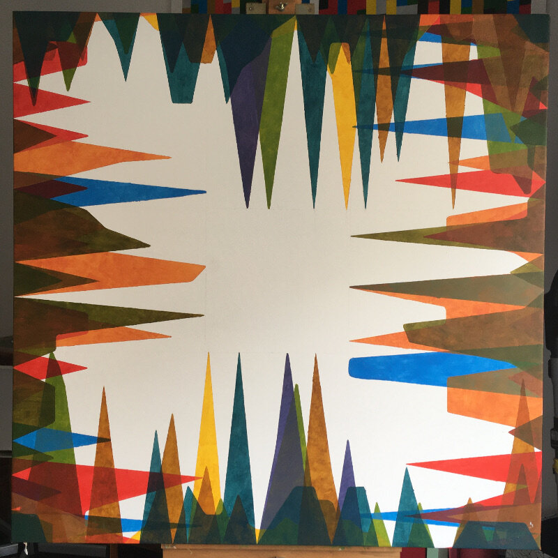
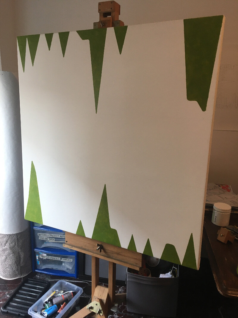
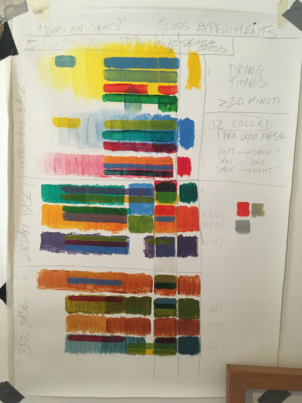
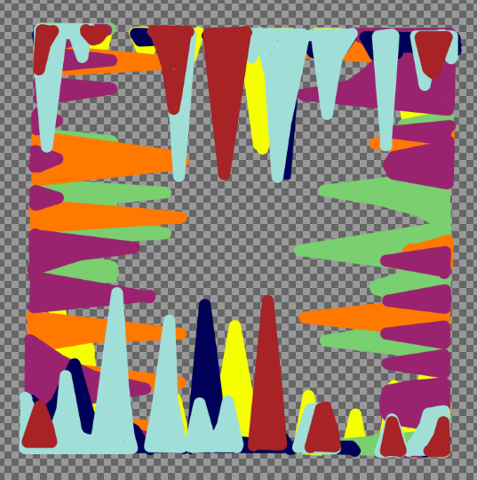
le opere in mostra: Choice Material (2021), Bums on Seats, The Dilemma, First Past the Post, A Coincidentalist Work (2020), 14 Exposures (2018)

di Alessandro Allocco

Puro significato, pura materia, povertà del soggetto, ma ricchezza infinita di un "credo" fortissimo: il cambiamento dell'arte.

"Raccolta da un esilio" è il lavoro, frutto di un'appassionata ricerca di Sam Vickers, esposto presso ATB Associazione Cultuale. E un esperimento di "non-arte come arte" nell'era dei social media,. Una serie di opere interattive baste sul tempo e sulla scelta dei materiali che trovano la loro ragion d'essere tra la vacuità concettuale e valore materiale in costante fluidità di significato pregna o scevra di valore affettivo a seconda che rientri o meno in una tendenza di mercato (di per sé privo di phatos, sensibile solo alle logiche economiche). Le opere di Sam Vickers traducono visivamente la voglia di dare al modo di percepire l'arte, un segno di cambiamento effettivo attraverso concetti coerenti ispirati dai social. In questa sua crociata in "esilio", l'artista britannico rinnova un linguaggio pittorico con la raffinatezza della materia provocatoriamente trasformata solo dal tempo. Le opere in esposizione, materiche e social, sono una concreta affermazione di stile dell'artista britannico. Sam Vickers ricerca l'avanguardia nel XXI secolo, come già fecero molti suoi colleghi artisti nel XX da Fontana a Burri, attraverso la tendenza a riconoscere un significato fondamentale alla materia non più subordinato all'immagine che si vuole rappresentare, in quanto è la materia stessa protagonista dell'opera.

 Artisti del Neodadaismo come Rauschenberg, Johns, e Nevelson oppure dell'Arte Informale come appunto Burri, Milani, Somaini o addirittura del gruppo Gutai rientrano nella cerchia dei sostenitori della "materia", ma già nel precedente Surrealismo e Futurismo possiamo riscontrare grande interesse che avvalorerà quest'importante corrente artistica.

I primi quadri materici vennero realizzati con chiari intenti provocatori di denuncia sociale: violenti strappi, inquietanti sfondi neri o accozzaglie di tessuti senza una forma precisa, ma con simboli inerenti al contesto storico, gioielli dal fascino innegabile che suscitano curiosità e interesse. "Raccolta da un esilio", affronta una complessa questione: la non-arte è arte? Questo concetto non è nuovo anche se, nel nostro mondo occidentale odierno, la scissione tra Arte e non-arte è piuttosto recente. C'è una lunga storia legata al "quotidiano" -in particolar modo con il pensiero modernista- in cui il mondano sublima in quella "carica creativa" tipica del linguaggio artistico contemporaneo. Le opere di Sam Vickers in esposizione sostengono "un approccio culturale e olistico, soprattutto non etnocentrico, nella delineazione del processo di costruzione delle idee, delle pratiche e delle istituzioni delle arti..." (Larry Shiner in The invention of Art. A Cultural History 2001).

Il concetto di non-arte come arte si collega alle nuove e migliorate condizioni sociali del nostro opulento occidente, che hanno stimolato nuovi gusti e concezioni estetiche in verità dissimili rispetto alle realizzazioni accademiche del passato: nuovi luoghi nei quali fare esperienza e discutere di poesia, di pittura o musica strumentale al di fuori delle loro tradizionali funzioni sociali, luoghi fisici e virtuali, materiali e immateriali.

Il concetto di non-arte come arte non può prescindere dalla storia dell'arte attraverso la quale si percepisce che in ciò che la nostra cultura considera artistico c'è varietà di tempo, di luogo e di strato sociale come ben sottolineava Picasso che riconosceva l'arte in oggetti quotidiani, di lavoro o feticci provenienti dall'Africa o dall'Oceania (maschere rituali, bastoni, lance) e li innalzava a oggetti da museo. Aveva ragione perché, al di là del sistema di relazioni sociali che l'arte ha da sempre generato nella cultura e al di là dei diversi modi e stili di creatività formale, la dimensione estetica è sempre propria di ogni attività umana.

Il concetto di non-arte come arte è un elemento esperienziale comune e trasversale che interessa tutti gli strati sociali perché, in fondo, essere artisti è una caratteristica fondamentale della nostra specie, è bisogno e capacità codificata nella nostra memoria genetica, è necessità elementare dell'essere umano alla continua ricerca di appagamento, soddisfazione e agio, al di là della mera utilità.

Bums on Seats Part VII - Artwork Review

It might have taken five months to execute but “Bums on Seats” is now finished. Five months you say?! That’s ages! Well, let’s be glad that it wasn’t twelve as the concept points out - a year of analytical data on canvas that represents the weirdly obsessive nature of being a virtually present artist. Parts one to six of this essay series cover the original ideas, developments and other such matters (so start there if you’re new to this) but this one is a review - so was it all worth it?

I think it certainly looks good; it’s quite close to what I had imagined back in August (gallery image 1) but the main observation would be that it now sits in a curious place between statistical exactitude and layered abstraction. The balance between the monthly colours was planned to flow from green back to green again (each one being a slightly different tint from the last) but threw up some difficulties in getting the right levels of medium transparency. But that’s just technical really- the overall effect is in keeping with its purpose.

The negative space works well and certainly reveals some patterns as to how my website is working. It has been perplexing to see people going mad for it one day but quieter than Hillary Clinton’s victory parade the next. One regret is not introducing some indicator of geography for “Bums…” which could have added extra meaning to it but nevertheless, it’s evident from this work that the site is at its hottest in the middle of the month. Do bigger numbers make you a better artist? Do lower ones make you a bad one? It’s a very modern dilemma but one that I hope that this work raises.

Working on canvas again after such a long time would be another positive that I can take from this piece. In fact, to have one hanging on the wall makes a refreshing change (gallery image 7) and producing a more subtle yet varied colour palette was fun (as opposed to “First Past the Post”, which was a straight from the tube affair).

I’m also happy to announce that “Bums on Seats” will be exhibited at the upcoming Fourth Edition of the Virtual Art Fair. Opening January 29th Curated by Lucy Fiona Morrison

Web link thevirtualartfair.co.uk/

Instagram @thevirtual.artfair

Bums on seats Part VI (Killing-time based work)

Many artists that I have spoken with would have heard me state that work needs to be finished quickly in order to avoid stagnation. Any protracted length of time allows your visual certainty to slowly escape like air from an unattended bike tyre, leaving you with more questions to answer than the singular one that got you started. This is something to be avoided at all costs. Yet there are some who embrace it, making time the essence of the work; the photographers, for example, that take the same kind of image every day for ages, portraits of themselves or their kids or whatever. In most cases, it’s some banal activity that represents a period of controlled creation, the length of that period usually being the most interesting thing about it.

“Bums on seats” is lazily drifting into that category. I’m at the mercy of the system that I myself produced and it now feels like more of a ‘killing time’ based work than anything else. The data from October is in and transferred to canvas but nothing can be laid down until the end of the month- it would skew the results if I did. Coming up with a time based work halfway through the period that you intend to record puts you in a ridiculous situation when you catch up with yourself. It’s similar to when you exceed the allotted skips per hour of a certain audio service and then having no choice but to endure whatever dross they give you.

In any case here’s a review of the work month by month. It’s interesting that each colour is still largely discernible, even if the layers have started to blend into each to form a brownish blue. Schematically speaking, the plan is to paint the December results in a colour close to the bright green of January; thus representing the Internet’s never ending stream of information.

Bums on seats Part V (goodbye base camp)

base camp.JPG

It seemed a shame to ruin it really, this satisfyingly square first attempt at a canvas. Last week’s fear over what to do next turned into what I can only describe as a modernistic inertia, as it sat in the studio waiting to be defiled. I had built it up too much; that first gestural mark felt like it had to encapsulate everything that I’ve written about so far: the internet, attention culture, the old theatre crowd, colour theory and the death of interest. All things considered, this reluctance is the down side of having a clear concept in mind, there could never be anything spontaneous or automatic about this work, otherwise it would be a stab in the back- if only with a paintbrush. Yet, working to a plan gives a visual idea some semblance of intention and meaning, especially when something as flippant as colour comes crashing into the room; such a thing can throw you completely. A plan honours the original idea; if something stuck out in your mind as being better than something else in the beginning, then why not try to stay as close to that moment as possible?

I have said many times before that my work comes from the concept, a contextual version of base camp if you will. The best route, potential hazards and the appropriate equipment all depend on what’s decided over bacon and eggs- how do we get to the top without dying or losing sight of why we’re even here? They say each mountain climb is different and that goes for making art too but to continue this ‘lofty’ analogy would give you altitude sickness sooner or later so let’s get to the point- the interesting thing about “Bums on Seats” (working title) is that it carries on from “First Past the Post” and “Straight from the horse’s ass” in the sense that they are all rigorously planned, painted abstractions that represent a system. I say interesting because producing three examples of similar work in close succession is strange for me- I should be bored with it by now.    

Onto the painting itself- I have started out with the data that relates to January and February. The composition relies on each edge of the canvas serving as the original x axis and the centre as the void that the subjects try to reach into. I’m looking for some balance within the painting so the matching colour spikes (relating to page views, visitors etc) will mirror each other from opposite sides. After conducting some experiments recently I am choosing colours that worked, or at least complimented or blended into each other to form a range of darker tones. As the layers become more complex I hope to see some colours either dominate or fade at first glance (in the same way that visitor hits from earlier this year barely seem relevant to what’s happening now, even if was an impressive statistic at the time).

My knowledge of oil paint is sketchy at best so this piece is being made with gloss medium and acrylics. Using the former would be like going up K2 without any decent boots…

Bums on Seats Part IV

This week is all about colour. Yes I know, colour theory has been done to death but I feel that it’s important to consider it- especially following my recent works “First Past the Post” and “Straight from the Horse’s Ass”. I would also say that because I haven’t worked on a painting for a while (in the traditional sense) it serves as a reminder to not make any schoolboy errors. Experimentation is all well and good but the wrong choices will confuse everything. Or will they?

Up to this point the work has been mainly talking about the progression of time and the obsessive nature of your own online presence. So how do these abstract concepts relate to a colour scheme?

In truth it’s all down to interpretation; would I consider a month with crap viewing figures as being a cold colour? Or alternatively, would a green or a blue indicate a calmer feeling of, “oh well last month went alright so I don’t need to worry about it...”? On the flip side, warmer colours mean something different but essentially carry the same set of  contradictions. It’s a bugger alright.

Christ, don’t trip over your laces on the starting line, it’s only colour, they’ll fade over time anyway- which does in fact lead me into the next point. I mentioned the passage of time earlier and this work (which will account for a year’s worth of analytics) represents how something as trivial as a statistic is all consuming but is then quickly overtaken by the latest data set. In the gallery below are some of the tests that I have been doing, beginning on canvas. In the later versions, even though the simple progression around the colour wheel can be digitally altered to any preference, it’s interesting how complimentary colours cancel each other out even in a computerised simulation.      

The acrylic tests include some experiments with opacity using a gloss medium as a thinner. I would say that I’m unsure about which is the best ratio but in any case it felt like I was painting with dead expensive shampoo or conditioner- not ideal! However, translucency is something I should explore further as it gives the image more depth and would make a change from the block colours of the previous works.

Next week: preparing canvas ……..YAWN…… but seeing as I’m writing about everything…